![]()
Using Bold Accent Walls in a Mid-Century Color Scheme

So, you’ve fallen down the mid-century modern rabbit hole, huh? Same. There’s something about those clean lines, organic shapes, and—let’s be real—those unapologetically bold colors that just *chef’s kiss* make a space feel alive. But here’s the thing: if you’re going full MCM (that’s mid-century modern for the uninitiated), you can’t just slap on some teak furniture and call it a day. Nope. You need an accent wall that screams “I know my design history, and I’m not afraid to use it.”
Now, before you panic and default to beige (we’ve all been there), let’s talk about how to use bold accent walls in a mid-century color scheme without making your home look like a retro fever dream. Because, let’s face it, nobody wants their living room to resemble a 1960s motel lobby—unless that’s your thing, in which case, no judgment. 🙂
I’ve spent way too many hours (and dollars) experimenting with mid-century palettes, and I’m here to save you the trouble. Whether you’re a renter looking for a temporary pop of color or a homeowner ready to commit to something daring, this guide will walk you through everything you need to know. Ready to dive in? Let’s go.
1. Why Bold Accent Walls Work So Well in Mid-Century Spaces
Mid-century design is all about balance. You’ve got those sleek, minimalist furniture pieces paired with wild, geometric patterns and colors that somehow don’t make your eyes bleed. It’s a vibe. And a bold accent wall? It’s like the exclamation point at the end of a perfectly crafted sentence—it just completes the look.
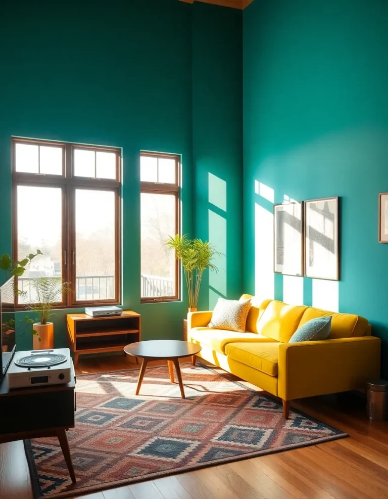
Think about it: a single wall in a rich mustard yellow or deep olive green instantly draws the eye without overwhelming the room. It’s a cheat code for making your space feel curated and intentional. Plus, if you’re renting or just indecisive (guilty), an accent wall lets you experiment without repainting your entire apartment.
And let’s not forget the psychological boost. Color affects mood, and a bold accent wall can make a room feel cozier, more energetic, or just plain cooler. Ever walked into a room with a deep navy wall and felt instantly more sophisticated? Yeah, that’s not a coincidence.
But here’s the kicker: mid-century color palettes are *chef’s kiss* perfect for accent walls because they’re bold but not garish. We’re talking earthy tones, muted pastels, and the occasional punchy primary—colors that feel fresh but still timeless. So, if you’re worried about your home looking dated, don’t be. These hues have been cool for 70 years, and they’re not going anywhere.
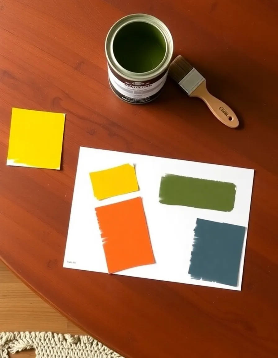
2. Picking the Perfect Mid-Century Color for Your Accent Wall
Alright, let’s get down to business. You want a bold accent wall, but which color? The mid-century palette is a treasure trove of options, but not all of them will work for your space. Here’s how to narrow it down.
First, consider the mood you’re going for. Want something warm and inviting? Look at burnt orange, mustard yellow, or terracotta. Prefer a cooler, more serene vibe? Try olive green, slate blue, or even a soft mauve. And if you’re feeling extra daring, go for a glossy cherry red or cobalt blue—just be prepared for the “wow” factor.
Next, think about your existing furniture. If you’ve got a lot of wood tones (and let’s be real, you probably do), warmer colors like ochre or rust will complement them beautifully. If your space is more neutral, you can go wild with something like emerald green or even a dusty pink.
Pro tip: Test your color in different lighting before committing. That perfect peachy-pink might look like neon coral under your living room’s overhead lights, and nobody wants that surprise. Trust me, I’ve learned the hard way.
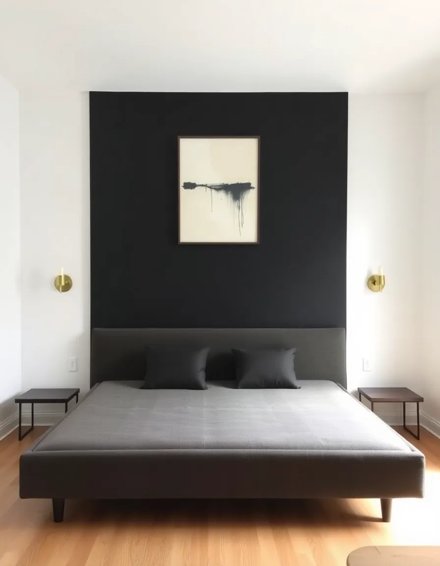
3. Where to Place Your Accent Wall for Maximum Impact
Here’s where things get fun. You could just paint the wall behind your sofa and call it a day, but where’s the creativity in that? Let’s talk strategy.
The best accent walls are the ones that naturally draw attention. In a living room, that’s often the wall behind the TV or fireplace. In a bedroom, it’s usually the wall behind the headboard. But don’t be afraid to think outside the box. A hallway with a bold color can feel like a gallery, and a kitchen with a single painted wall (maybe behind open shelving?) can look incredibly chic.
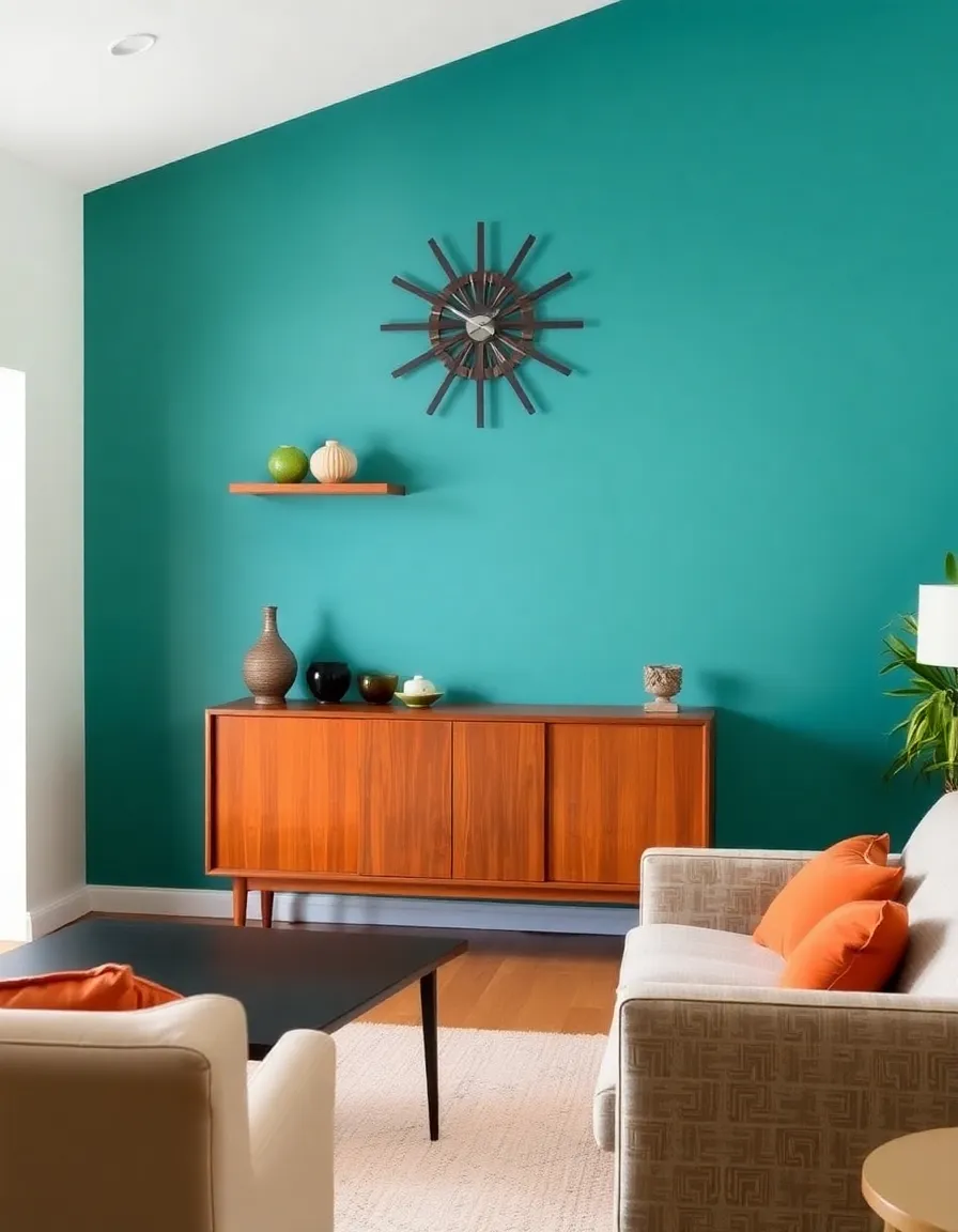
Another trick? Use your accent wall to highlight architectural features. Got a funky angled ceiling or a built-in bookshelf? Paint it! It’ll make the feature stand out even more. And if you’re in a small space, an accent wall at the far end of the room can make it feel deeper and more intentional.
Just remember: the accent wall should enhance the room, not fight with it. If you’ve got a giant, colorful piece of art or a busy wallpaper elsewhere, maybe skip the bold paint. Too much competition, and your eyes won’t know where to look.
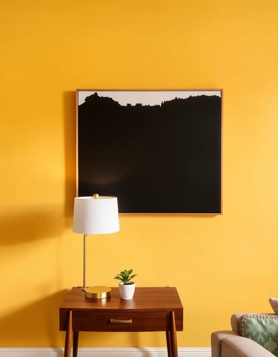
4. Pairing Your Accent Wall with the Right Decor
Now that you’ve got your wall color sorted, let’s talk decor. Because a bold wall is just the beginning—what you put on it (or near it) can make or break the whole look.
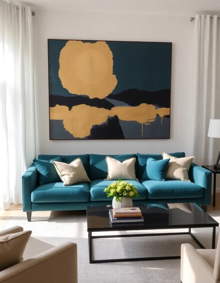
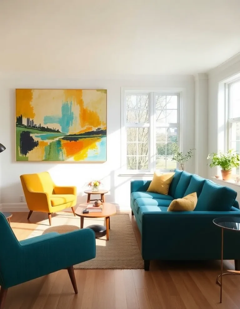
First rule of thumb: let the wall shine. If you’re going bold, keep the decor simple. A single large piece of art, a sleek floating shelf, or a statement mirror can be all you need. Overcrowding the wall with tiny frames or knickknacks will just dilute the impact.
Second, balance is key. If your wall is a warm tone, pair it with cooler decor (think black-and-white photography or metallic accents). If it’s a cool color, warm it up with wood tones or brass finishes. And if you’re feeling extra fancy, throw in a plant or two. Mid-century design loves a good fiddle-leaf fig.
Oh, and lighting matters. A bold wall can look flat under harsh overhead lights, so add some warm, directional lighting—sconces, floor lamps, or even a funky pendant. It’ll add depth and make the color feel richer.
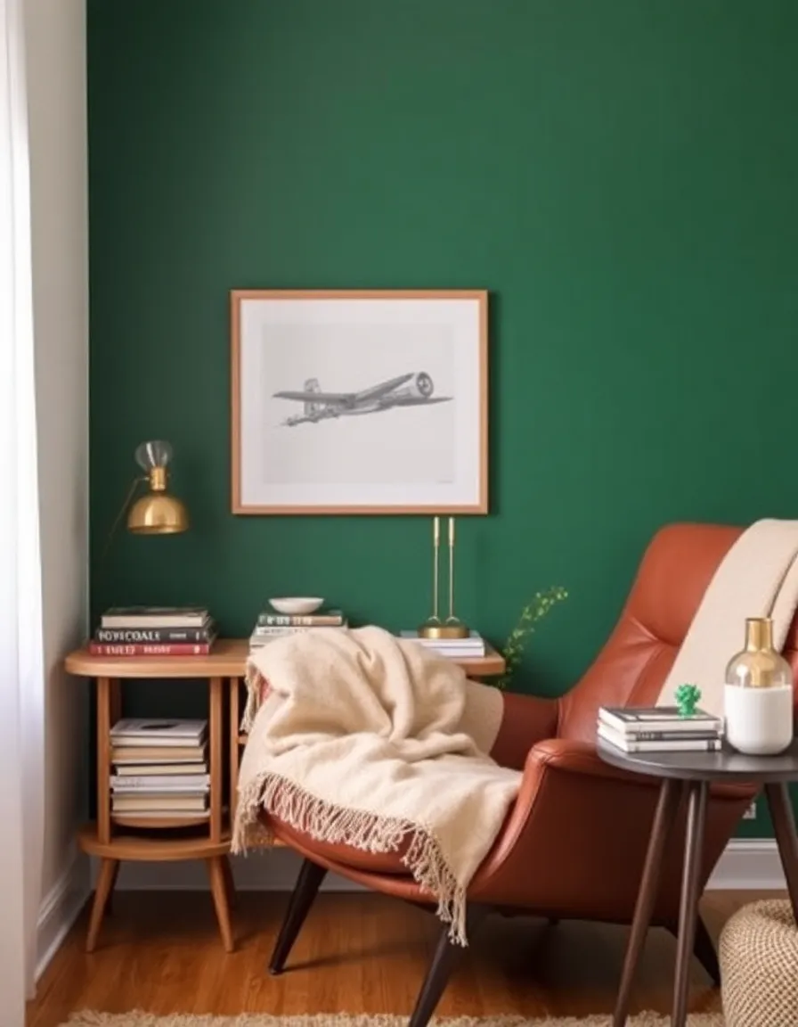
5. The Finishing Touches: Textiles and Accessories
You’re almost there! Now it’s time to tie everything together with textiles and accessories. Because, let’s be real, a room isn’t complete until you’ve thrown in a few pillows and maybe a weird little vase.
When it comes to textiles, think texture and contrast. A bold wall pairs beautifully with nubby wool throws, sleek leather cushions, or even a shaggy rug. Just don’t go overboard with patterns—unless you’re mixing geometric prints, in which case, go nuts (but keep the color palette cohesive).
Accessories are where you can have fun. A vintage rotary phone, a quirky ceramic sculpture, or a stack of old design books can add personality without cluttering the space. And don’t forget the power of a good plant. A snake plant or monstera in a retro planter? Instant vibe.
Finally, step back and assess. Does the room feel balanced? Does your eye move naturally from the accent wall to the rest of the space? If not, tweak until it does. And remember: mid-century design is all about effortless cool, so don’t overthink it. Sometimes the best rooms are the ones that look like they just *happened*.
And there you have it—your guide to using bold accent walls in a mid-century color scheme without losing your mind (or your security deposit). Whether you go full-on atomic age with a fiery orange or keep it subtle with a muted sage, the key is to have fun with it. After all, design should be playful, not stressful.
So grab a paint sample, channel your inner Don Draper (minus the problematic bits), and get to work. And when your friends inevitably ask how you made your place look so good, just smile and say, “It’s a mid-century thing.” They’ll nod like they understand, and you’ll know the truth: you’re basically a design genius now. 🙂