![]()
Trending Paint Colors Inspired by 1970s Palettes
Hey there, color lover! If you’ve ever scrolled through Pinterest or wandered the aisles of a vintage thrift store and thought, “Man, the ‘70s really knew how to do color,” then buckle up. We’re diving deep into the groovy, earthy, and sometimes downright wild paint palettes that defined the decade—and guess what? They’re making a major comeback. Whether you’re a die-hard retro fan or just looking to spice up your space with something fresh (yet nostalgic), these trending ‘70s-inspired paint colors will have you reaching for the roller in no time.
Now, I know what you’re thinking: “Won’t my home end up looking like my grandma’s shag-carpeted basement?” Not if we do it right. The key is balancing those bold, warm tones with modern touches—think avocado green paired with sleek black accents or burnt orange softened by creamy neutrals. Trust me, when done well, these colors don’t just work—they sing. So, grab your bell-bottoms (or don’t, no judgment here), and let’s get into it.
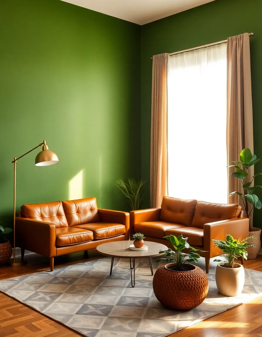
1. Earthy Avocado Green: The Ultimate Throwback
Ah, avocado green—the color that somehow managed to coat every appliance, wall, and piece of furniture in the ‘70s. But before you write it off as “too retro,” hear me out. This isn’t the sickly, muted green of your childhood kitchen. Today’s versions are richer, deeper, and way more sophisticated. Picture it: a moody avocado accent wall in a modern living room, paired with brass fixtures and a sleek leather sofa. Suddenly, it’s not “grandma’s kitchen”—it’s a designer’s dream.
Why does this shade work so well now? It’s all about the earthy, organic vibes. In a world where we’re all craving a little more connection to nature (thanks, Instagram), avocado green brings the outdoors in without screaming “I’m a houseplant.” Plus, it plays surprisingly well with other trending colors like terracotta and mustard yellow. Want to go bold? Try it in a high-gloss finish for a luxe, retro-modern look.

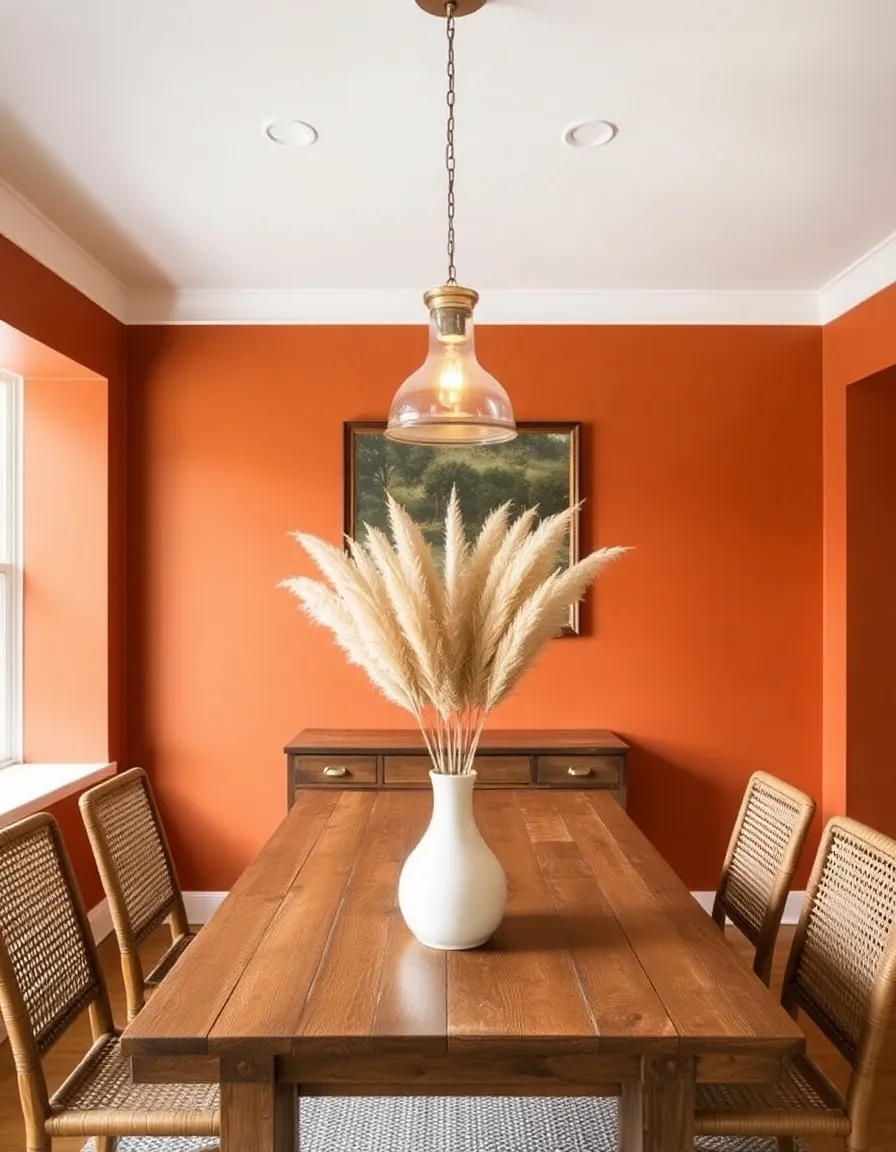
2. Burnt Orange: The Cozy Powerhouse
If avocado green is the quiet, cool kid of ‘70s colors, burnt orange is the life of the party. This shade is warm, inviting, and just a little bit spicy—like your favorite fall sweater but in paint form. I used to think orange was a hard no for walls (flashbacks to my college apartment’s “experimental” phase), but burnt orange? It’s a game-changer.
The magic of this color lies in its versatility. Use it in a dining room for a rich, intimate vibe, or slap it on a front door to make your home the envy of the neighborhood. Pair it with creamy whites or deep browns to keep it from feeling overwhelming, or go full ‘70s with mustard yellows and olive greens for a palette that screams “Saturday night disco.” Pro tip: If you’re nervous, start small—a burnt orange bookshelf or throw pillow can test the waters without commitment.
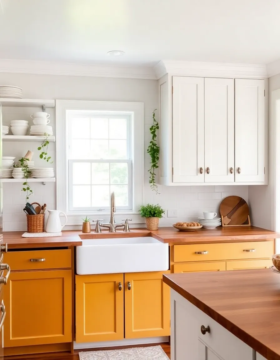
3. Harvest Gold: Not Your Grandma’s Yellow
Okay, I’ll admit it—when I first considered harvest gold for my own home, I hesitated. Visions of outdated refrigerators and dingy linoleum danced in my head. But today’s harvest gold is a far cry from its dated predecessor. We’re talking about a muted, golden hue that feels more like a sunlit wheat field than a relic from the past.
This color shines (pun intended) in spaces where you want warmth without the intensity of a true yellow. Try it in a sunroom or kitchen for a cheerful yet sophisticated vibe. Pair it with crisp white trim and natural wood tones to keep it fresh, or lean into the retro aesthetic with macramé wall hangings and rattan furniture. Either way, harvest gold brings a sunny optimism that’s hard to resist—no shag carpet required.
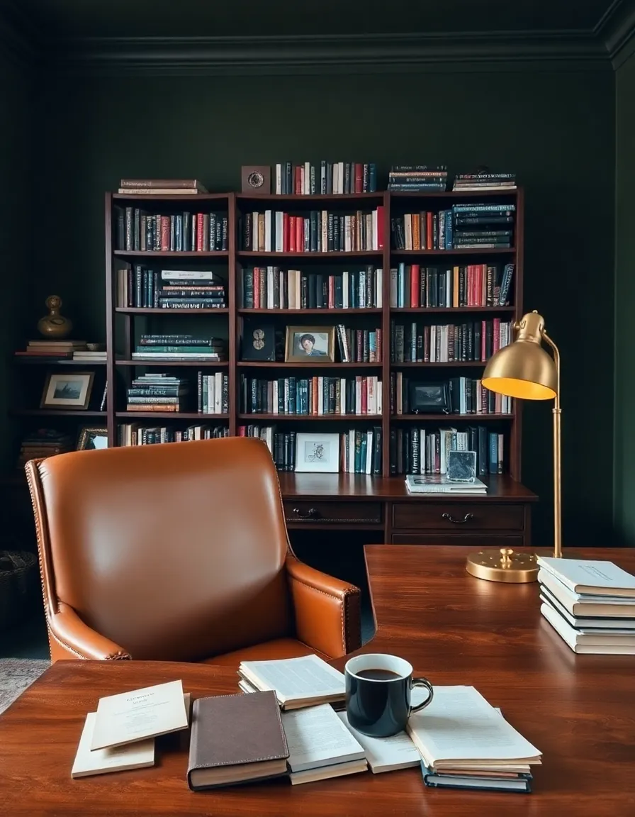
4. Moody Olive Green: The Sophisticated Sibling
Olive green might not have the same instant name recognition as avocado or harvest gold, but trust me—it’s the unsung hero of ‘70s palettes. This color is moody, elegant, and surprisingly neutral. Unlike its brighter cousins, olive green has a quiet depth that makes it perfect for creating cozy, intimate spaces.
Imagine a home office with olive green walls, a vintage wooden desk, and a cognac leather chair. Suddenly, your Zoom background is giving “English library” instead of “Ikea showroom.” Or, use it in a bedroom for a serene, nature-inspired retreat. Pair it with blush pink or terracotta for a modern twist, or keep it classic with black and white accents. The best part? Olive green looks amazing in any lighting—moody at night, fresh and earthy during the day.
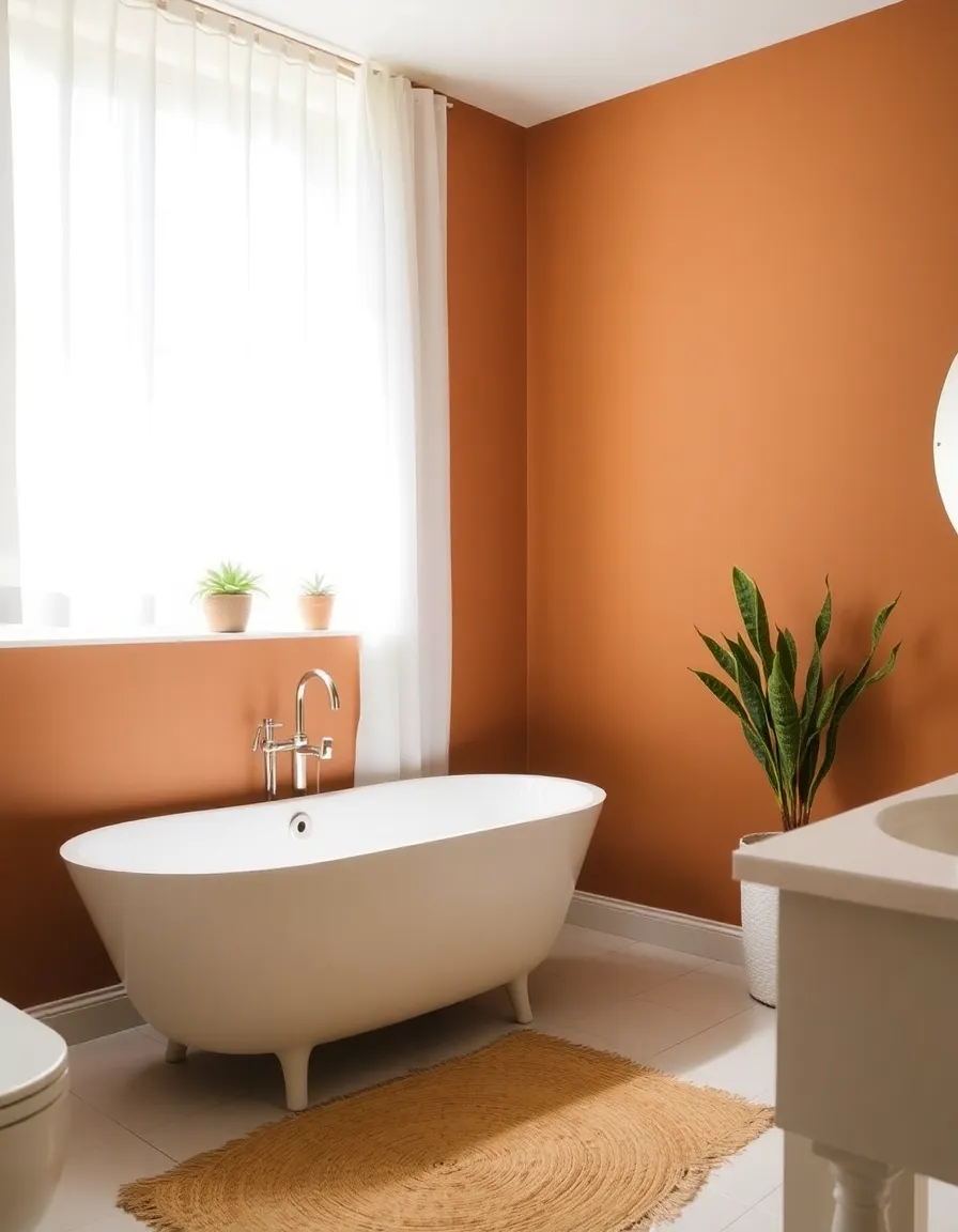
5. Terracotta: The Warm Hug of Color
If colors had personalities, terracotta would be that friend who gives the best hugs. It’s warm, grounding, and just a little bit rustic—without veering into Tuscan villa territory (we promised no Tuscan, remember?). This shade is having a major moment right now, and for good reason: it’s the perfect bridge between ‘70s nostalgia and modern boho chic.
Use terracotta in a bathroom for a spa-like feel, or coat your bedroom walls in it for a cocooning effect that’s cozy but not cave-like. Pair it with crisp whites and natural textures like jute or linen to keep it fresh, or go bold with navy blue or emerald green for a high-contrast look. And if you’re not ready to commit to walls? Terracotta looks stunning on furniture, tiles, or even as an exterior paint color. Basically, it’s the MVP of the ‘70s palette revival.
So there you have it—five ‘70s-inspired paint colors that are totally worth bringing back. Whether you go full-on retro or just dip a toe in with an accent wall, these shades have a way of making spaces feel warm, lived-in, and full of personality. And hey, if anyone questions your choices, just tell them you’re “curating a vintage-modern aesthetic.” Works every time. Now, go forth and paint boldly, my friend. The ‘70s would be proud.