![]()
Top Mid-Century Modern Color Palettes to Style Your Space Right
Hey there, fellow design lover! If you’re anything like me, you’ve probably spent way too much time scrolling through Pinterest, drooling over those effortlessly cool mid-century modern spaces. You know the ones—clean lines, warm woods, and those *chef’s kiss* color palettes that make everything look like a retro dream. But here’s the thing: nailing those colors isn’t just about slapping on some mustard yellow and calling it a day. Oh no, my friend. There’s an art to it.
So, let’s talk about how to bring those iconic mid-century hues into your space without it looking like a time capsule (unless that’s your vibe, no judgment here). Whether you’re a seasoned MCM enthusiast or just dipping your toes into the world of atomic-age aesthetics, I’ve got you covered. Ready to dive in? Let’s go!
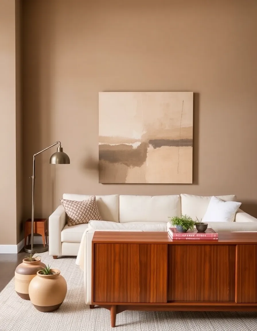
1. The Classic Earthy Neutrals: Warmth Meets Sophistication
Ah, the backbone of mid-century modern design—earthy neutrals. Think warm taupes, creamy whites, and soft beiges that make your space feel like a cozy hug. These colors are the perfect foundation because they let your furniture and decor shine without overwhelming the room. Plus, they’re timeless. Like, “your-grandma’s-house-but-make-it-fashion” timeless.
I once tried to skip the neutrals and go straight for the bold stuff in my living room. Big mistake. It looked like a crayon box exploded in there. Lesson learned: start with a neutral base, then layer in the fun stuff. Trust me, your future self will thank you.
Pro tip: Pair these neutrals with rich walnut or teak wood tones. The contrast is *chef’s kiss* perfection.

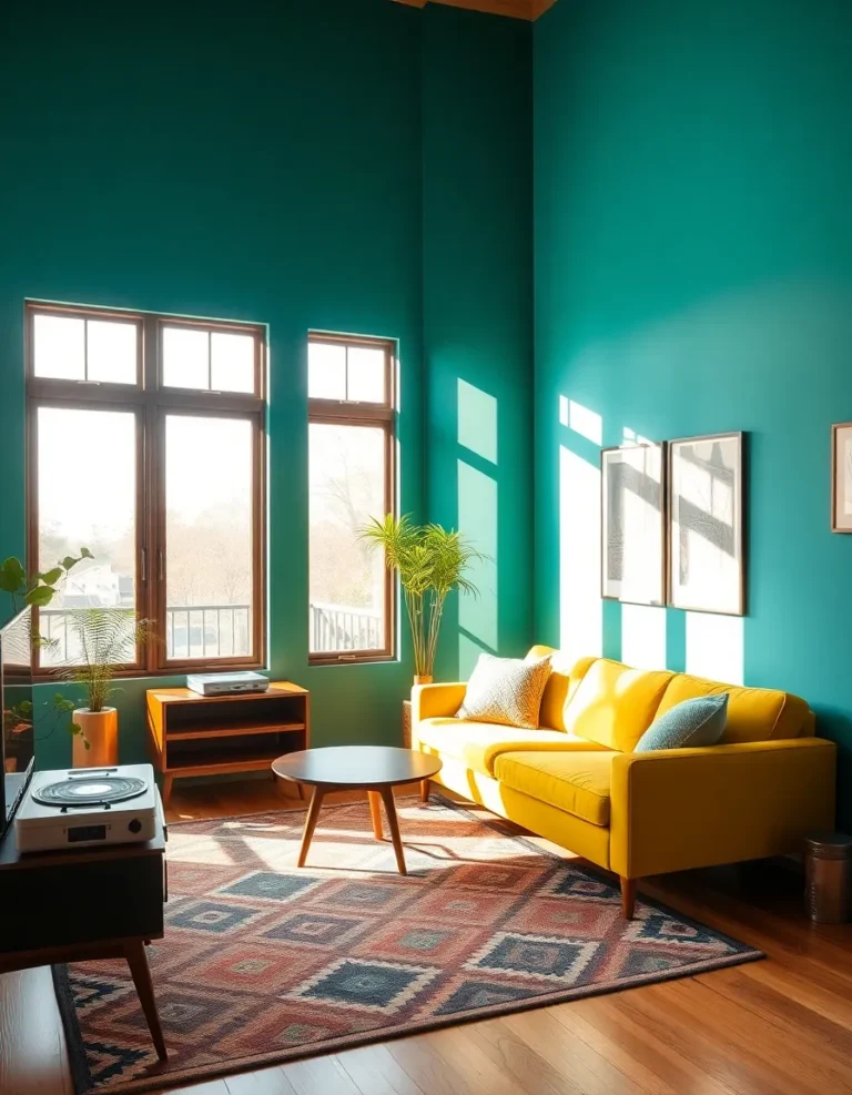
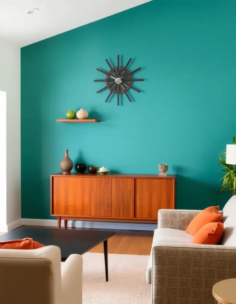
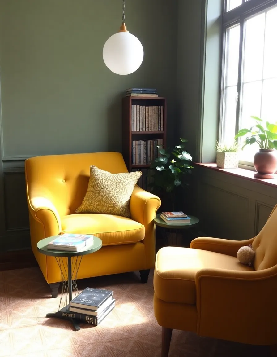
2. Mustard Yellow & Olive Green: The Dynamic Duo
If mid-century modern had a power couple, it’d be mustard yellow and olive green. These colors scream 1960s cool without being too in-your-face. Mustard adds a sunny, optimistic vibe, while olive green brings in that earthy, grounded feel. Together? Magic.
I have an olive green armchair in my office, and let me tell you, it’s the star of the room. Every time someone walks in, they’re like, “Where’d you get that chair?” (FYI, it was a thrift store score. Pat yourself on the back for me.)
Want to keep it subtle? Use these colors in accents like throw pillows, rugs, or even a statement lamp. Or go all out and paint an accent wall—you do you.
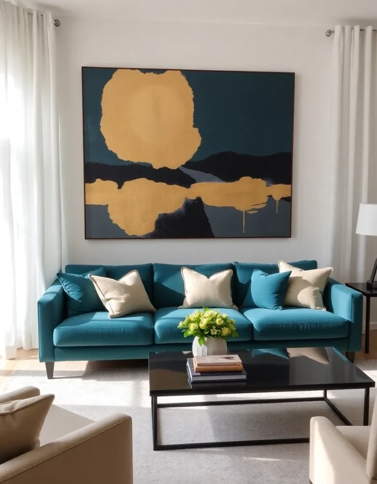
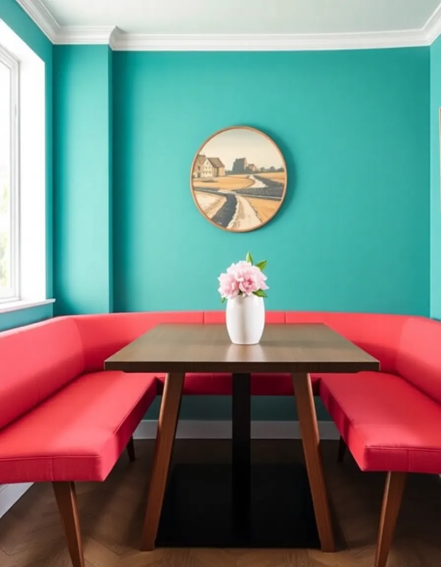
3. Teal & Coral: The Unexpected Pairing That Works
Okay, hear me out. Teal and coral might sound like they belong in a tropical cocktail, but they’re actually a match made in mid-century heaven. Teal brings the depth, coral brings the warmth, and together they create a vibe that’s both playful and sophisticated.
I was skeptical at first too, but then I saw a teal sofa with coral throw pillows in a design magazine, and my mind was blown. It’s like they were meant to be. Now, I’m low-key obsessed with this combo. Use it in moderation, though—unless you want your space to look like a retro diner (which, again, no judgment).
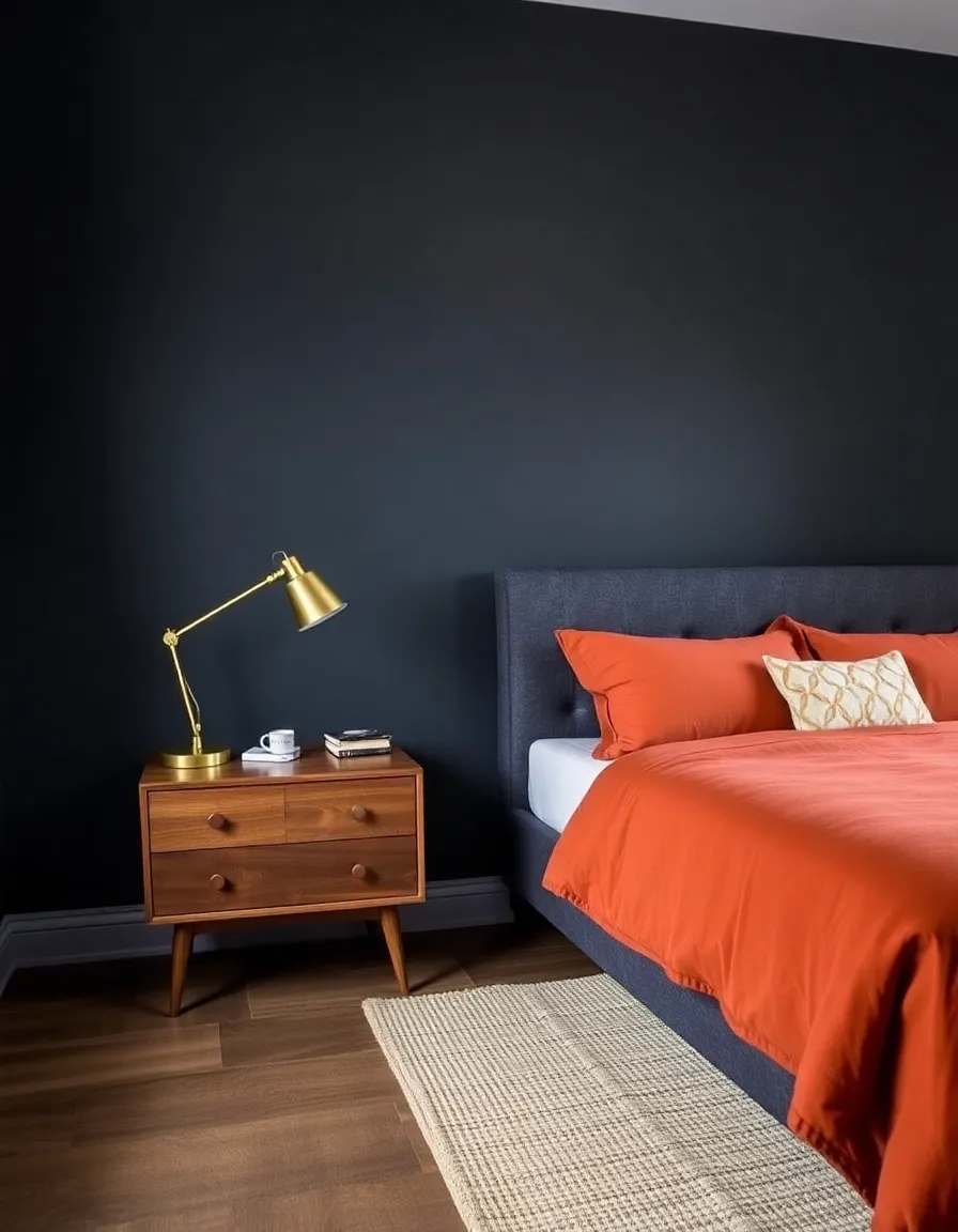
4. Charcoal Gray & Burnt Orange: Moody & Inviting
For those days when you want your space to feel a little moody (in the best way possible), charcoal gray and burnt orange are your go-tos. This combo is like the design equivalent of a leather jacket—cool, edgy, and impossibly stylish.
I painted my bedroom wall charcoal gray last year, and adding burnt orange bedding was a game-changer. It’s cozy, it’s dramatic, and it makes me feel like I’m living in a Wes Anderson movie. Win-win.
Pair these colors with plenty of natural materials—think jute rugs, wooden nightstands, and woven baskets—to keep the space from feeling too heavy.
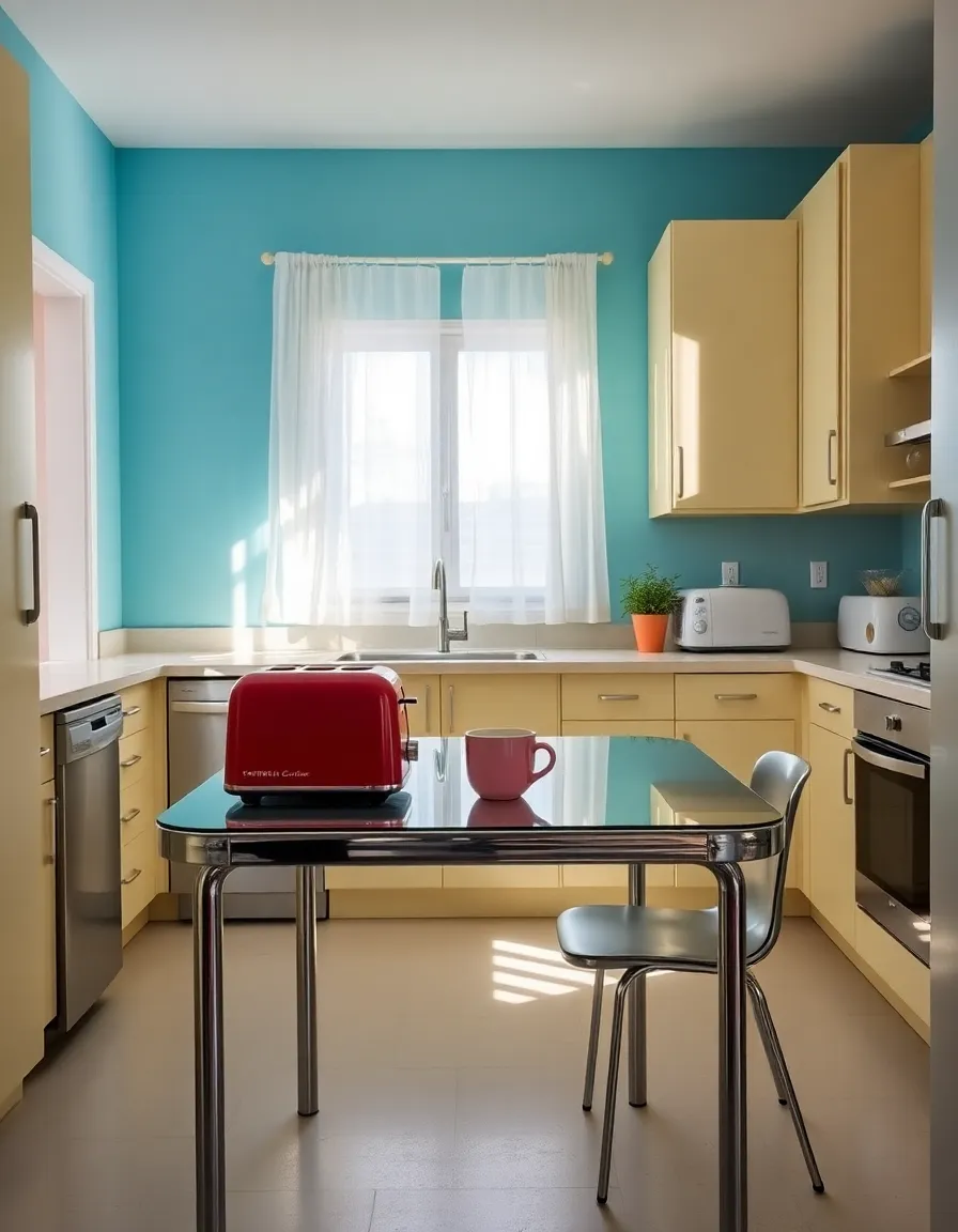
5. Sky Blue & Buttercream: Light & Airy Retro Vibes
If you’re all about that light, airy feel, sky blue and buttercream are your best friends. This palette is like a breath of fresh air—calm, cheerful, and totally timeless. It’s perfect for smaller spaces or rooms that don’t get a ton of natural light.
My kitchen is painted sky blue with buttercream cabinets, and every morning it feels like I’m making coffee in a 1950s dream. It’s the little things, right?
Add in some chrome or stainless steel accents to keep things feeling modern, and don’t be afraid to throw in a pop of red or pink for fun.
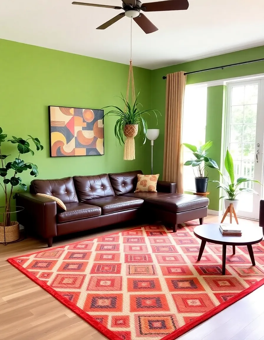
6. Chocolate Brown & Avocado Green: The Ultimate Retro Throwback
Okay, this one’s for the true mid-century purists. Chocolate brown and avocado green might sound like a weird smoothie flavor, but in design terms, they’re iconic. This combo is all about embracing the retro vibe—think shag carpets, wood-paneled walls, and funky patterned upholstery.
I’ll admit, this palette isn’t for everyone. But if you’re going for that authentic 1960s look, it’s a must. Just balance it out with plenty of white or cream to keep it from feeling like a time warp.
And there you have it—six killer mid-century modern color palettes to transform your space from “meh” to “heck yes.” Whether you’re all about those earthy neutrals or ready to dive headfirst into teal and coral, there’s a combo here for everyone. The best part? You can mix and match these palettes to create a look that’s uniquely yours.
So, which one’s your favorite? Drop a comment below (or just mentally high-five yourself if you’re reading this in the future). And hey, if you try any of these combos, I’d love to see how it turns out! Tag me in your pics—I’m always down for some design inspo. Happy styling, friend!