![]()
Top 70s Color Trends Making a Bold Comeback in Modern Decor

Remember the 70s? Bell-bottoms, disco balls, and colors so bold they could wake up the neighbors? Well, guess what—those iconic 70s hues are back, and they’re shaking up modern decor like a glitter-covered earthquake. If you’ve been craving a little retro flair in your space but don’t want to go full-on “grandma’s shag carpet,” you’re in luck. The 70s color palette is making a major comeback, and it’s bringing all the vibes without the avocado-green appliances (unless you’re into that, no judgment).
Why now? Maybe we’re all just nostalgic for a time when life felt a little groovier. Or maybe we’ve finally realized that beige walls are, well, kinda boring. Whatever the reason, 70s-inspired colors are popping up everywhere—from living rooms to Instagram feeds—and they’re giving modern interiors a much-needed dose of personality. So, grab your favorite lava lamp (or just pretend you have one), and let’s dive into the top 70s color trends that are stealing the spotlight again.
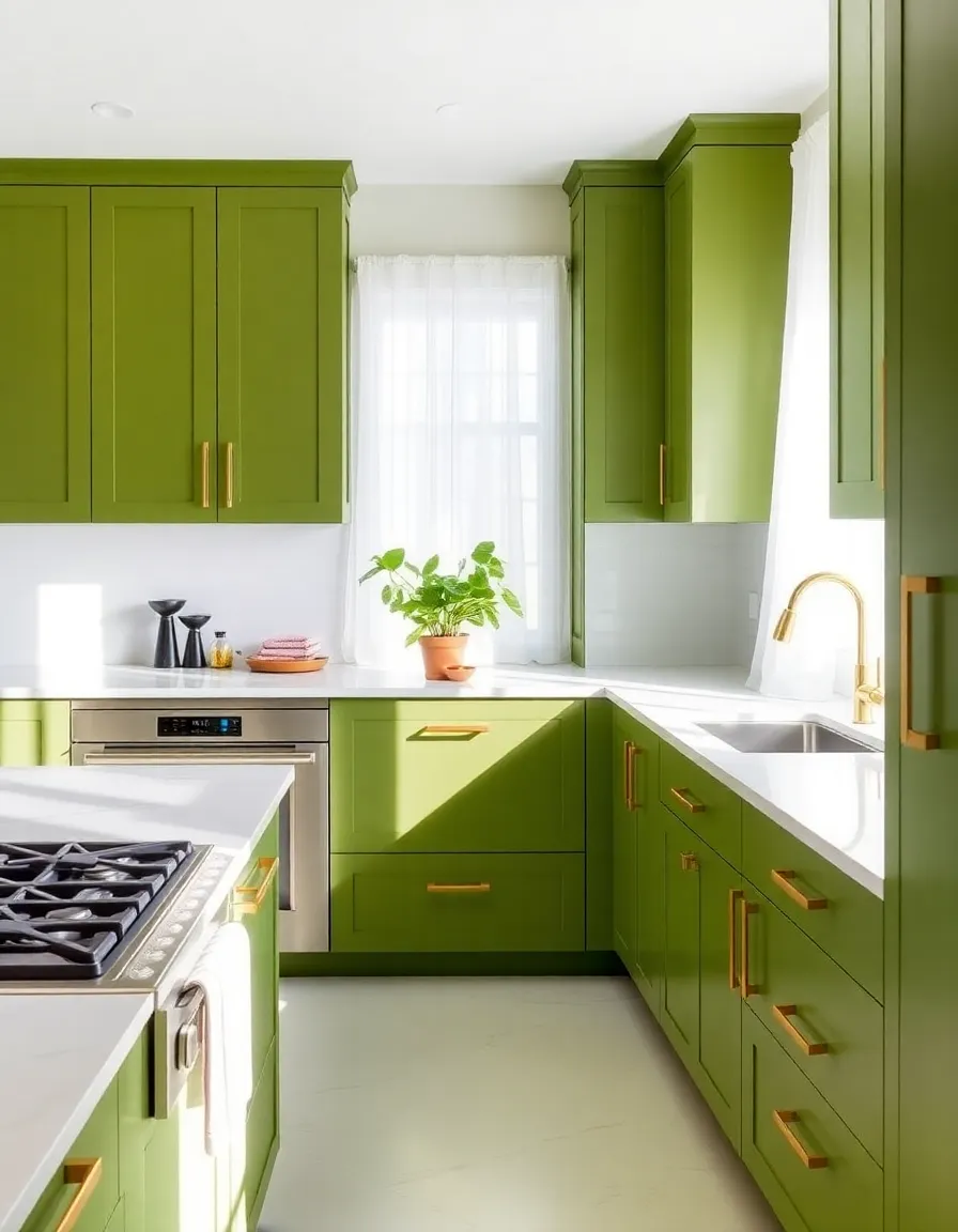
1. Avocado Green: The Love-It-or-Hate-It Shade
Ah, avocado green—the color that defined kitchens (and refrigerators) of the 70s. This earthy green with a hint of yellow undertones is polarizing, I’ll admit. Some people see it and immediately think “outdated,” while others (like me) think “heck yes, let’s bring this back in a chic way.” And guess what? Designers agree. Modern takes on avocado green lean into its retro charm but pair it with sleek finishes and minimalist furniture to keep it fresh.
Think matte avocado cabinets with brass hardware or a single accent wall in a muted version of the shade. It’s all about balance. Too much and you risk your home looking like a time capsule; just enough and you’ve got a space that feels warm and inviting with a side of nostalgia.
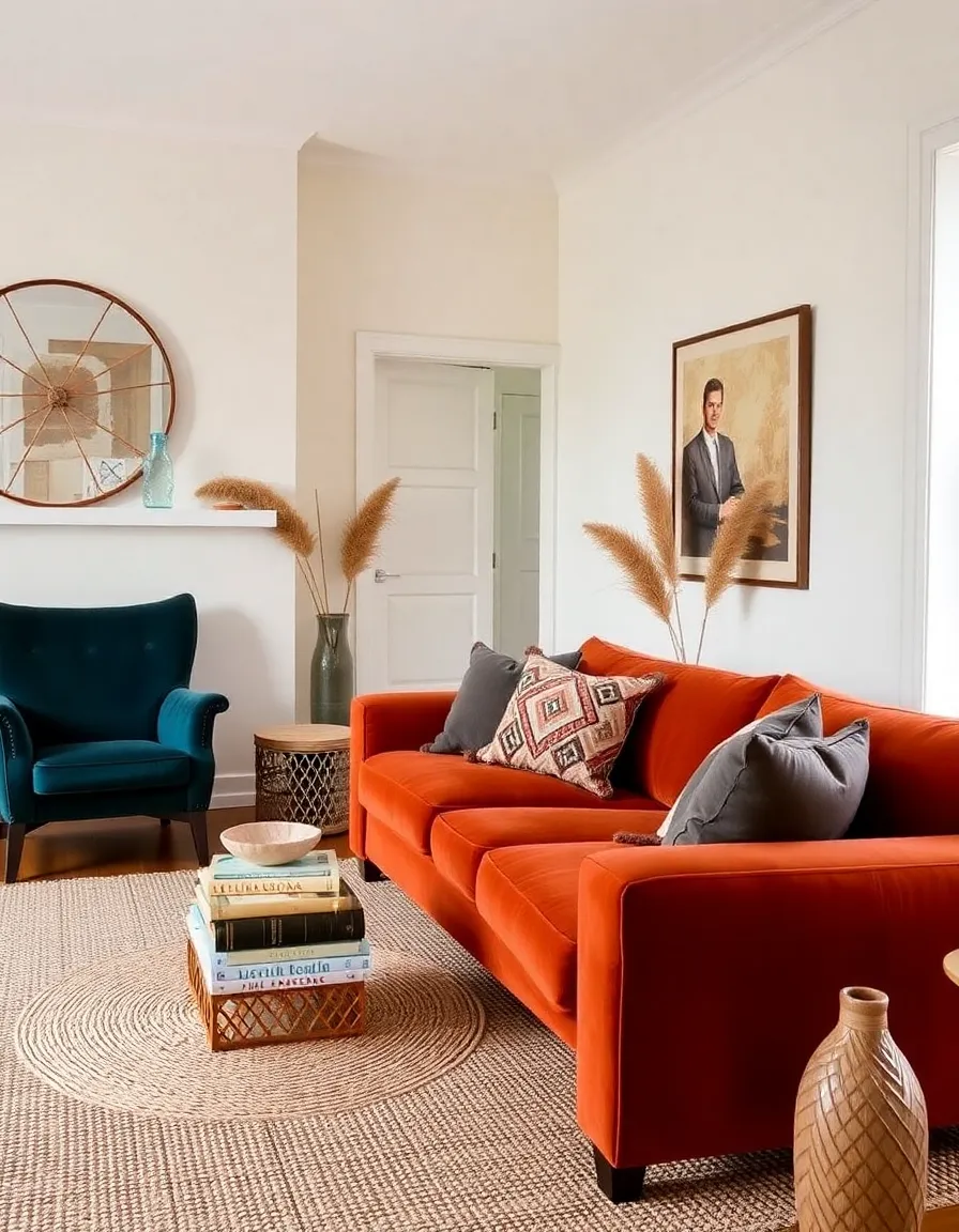
2. Burnt Orange: The Cozy Comeback Kid
If there’s one 70s color that screams “autumn vibes forever,” it’s burnt orange. This rich, warm hue was everywhere back in the day—sofas, wallpapers, even those weird carpeted bathrooms (RIP). But today, burnt orange is shedding its dated rep and emerging as a sophisticated choice for modern spaces. Why? Because it’s the perfect blend of bold and cozy.
Picture a burnt-orange velvet sofa against a neutral backdrop, or terracotta pots filled with lush greenery. It’s a color that instantly makes a room feel lived-in and welcoming. Plus, it pairs amazingly with deep blues and mustard yellows if you’re feeling adventurous. Pro tip: Use it in textiles or decor first if you’re not ready to commit to a full wall. Throw pillows, anyone?
3. Harvest Gold: Not Just for Appliances Anymore
Harvest gold was the avocado green’s slightly flashier cousin in the 70s, showing up on everything from telephones to toasters. But today, this warm golden-yellow is getting a second life as a surprisingly versatile accent color. It’s like sunshine in a can—cheerful but not overwhelming when used right.
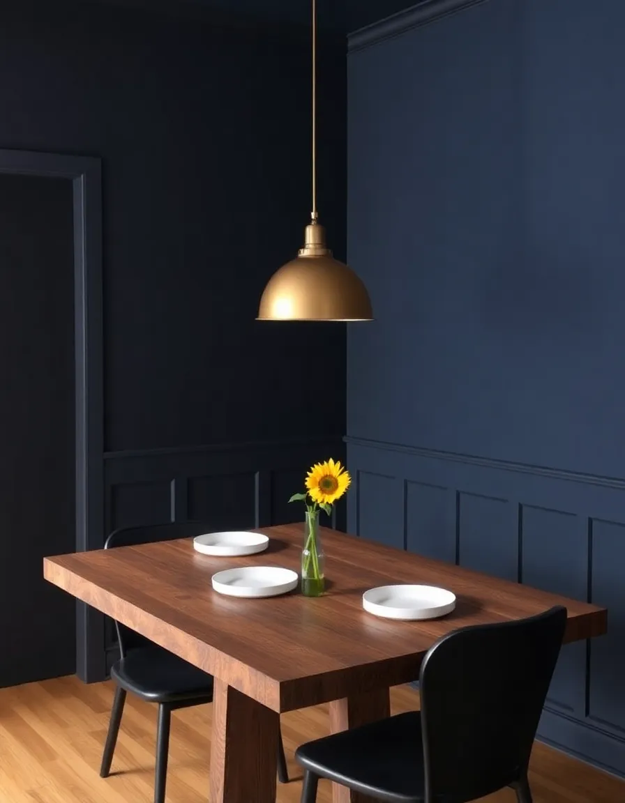
Try it in small doses: a harvest-gold lamp against a moody navy wall, or a set of ceramic vases on a wooden shelf. It also plays well with other 70s favorites like olive green and rusty reds. And if you’re feeling extra bold, why not go for a glossy front door in this hue? Instant curb appeal with a retro twist.
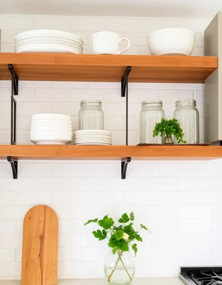
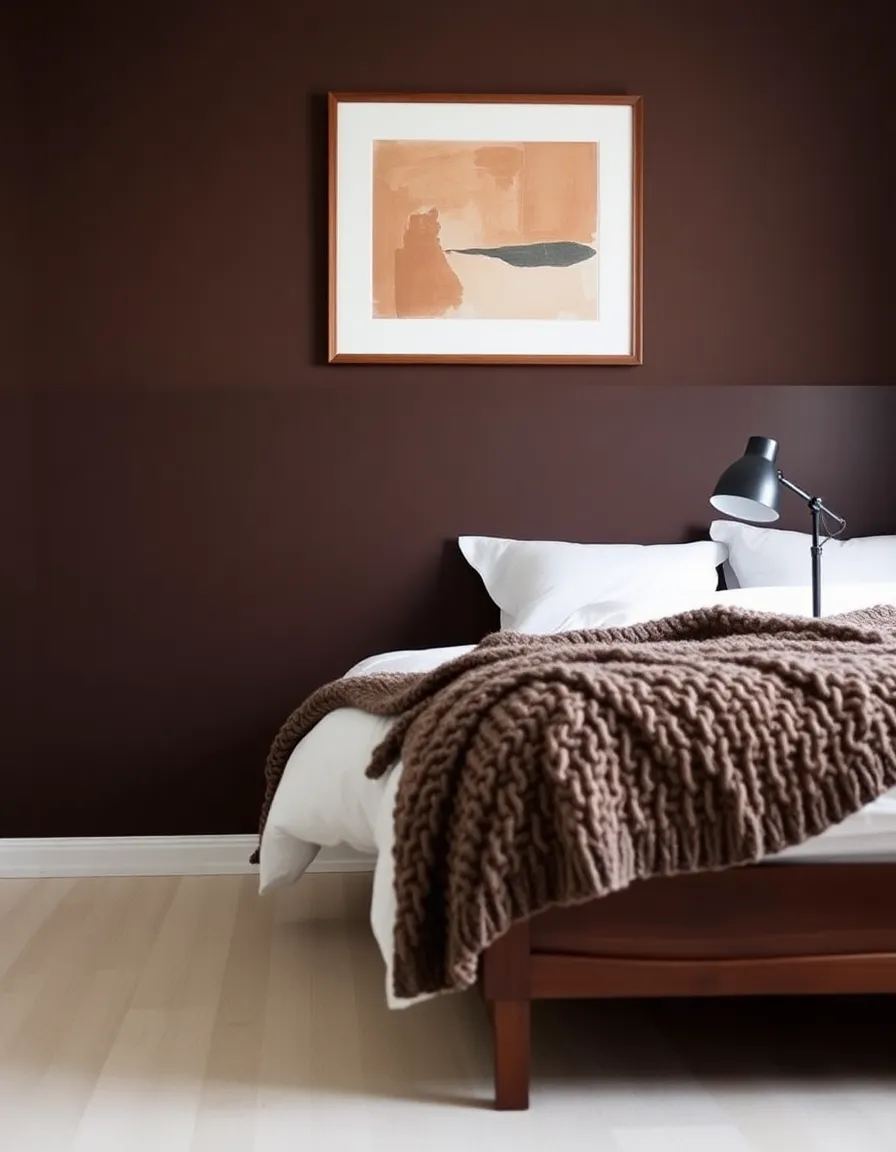
4. Earthy Browns: The OG Neutral
Before greige took over the world, earthy browns ruled the decor scene. Chocolate, caramel, coffee—you name it, the 70s loved it. And honestly? They were onto something. Brown is the ultimate warm neutral, and it’s staging a quiet comeback in modern interiors. Forget what you’ve heard about brown being boring; when done right, it’s anything but.
Think leather sofas in rich cognac, walnut wood furniture, or even a chocolate-brown accent wall paired with creamy whites. It’s a color that adds depth and warmth without screaming for attention. Plus, it’s basically nature’s neutral, so it works with everything. FYI, if you’re scared of going too dark, start with smaller decor pieces like woven baskets or ceramic table lamps.
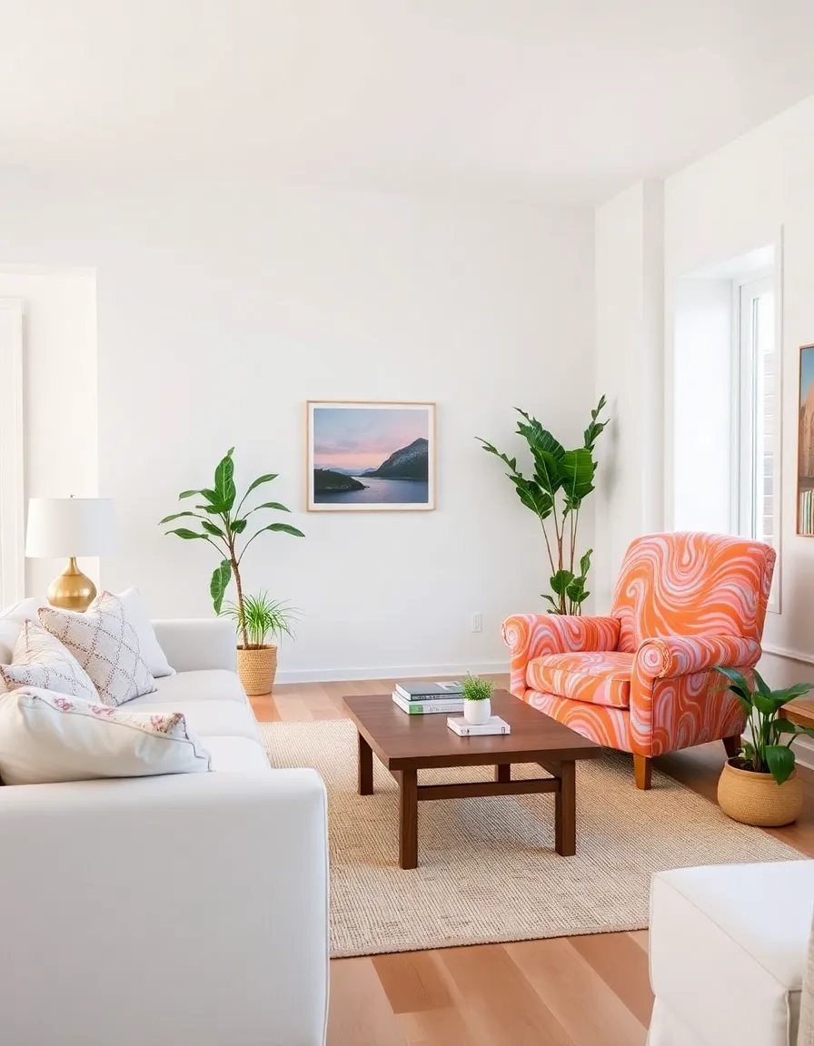
5. Psychedelic Prints: Because Why Not?
Okay, this one’s less of a single color and more of a wild, wonderful explosion of them. The 70s were all about bold, psychedelic prints—swirling patterns, trippy florals, and geometric shapes that could make your head spin (in the best way). And guess what? Maximalism is back, baby, so those eye-popping prints are totally fair game again.
Now, I’m not saying you should wallpaper your entire bathroom in a kaleidoscopic pattern (unless you want to, in which case, go for it). But a psychedelic-print throw pillow, a funky area rug, or even a single statement chair can add just the right amount of retro flair. Pair it with solid colors to keep things from getting too overwhelming, and let the print do the talking.
So there you have it—five 70s color trends that are making a serious splash in modern decor. Whether you’re all-in on avocado green or just dipping a toe into burnt orange, these retro hues are a fun way to add personality to your space. And hey, if anyone questions your choices, just tell them you’re a trendsetter. After all, everything old is new again, right? Now go forth and decorate like it’s 1975 (but with better Wi-Fi).