![]()
Soft Color Palettes for a Romantic French Look

Ah, the French—masters of romance, effortless style, and that je ne sais quoi we all secretly wish we could bottle. If you’ve ever scrolled through Pinterest or wandered the streets of Paris (lucky you!), you’ve probably fallen head over heels for those dreamy, soft color palettes that make everything look like it’s bathed in golden-hour light. You know the ones: delicate blush pinks, muted lavenders, creamy ivories, and just a whisper of sage green. They’re like a love letter to your home, and today, we’re diving deep into how to bring that romantic French look into your space—no passport required.
Now, I get it. You might be thinking, “But my living room looks more ‘college dorm’ than ‘Parisian chic.’” Trust me, I’ve been there. My first apartment was a tragic mix of hand-me-downs and questionable DIY projects. But here’s the secret: it’s all about the colors. Soft, subtle hues can transform even the most chaotic space into a serene, elegant retreat. And the best part? You don’t need to splurge on a château to make it happen.
So, grab a croissant (or, you know, a bagel—we won’t judge), and let’s talk about how to create that effortlessly romantic French vibe with the perfect soft color palette. By the end of this, you’ll be ready to whisper sweet nothings to your walls. Or at least give them a fresh coat of paint.
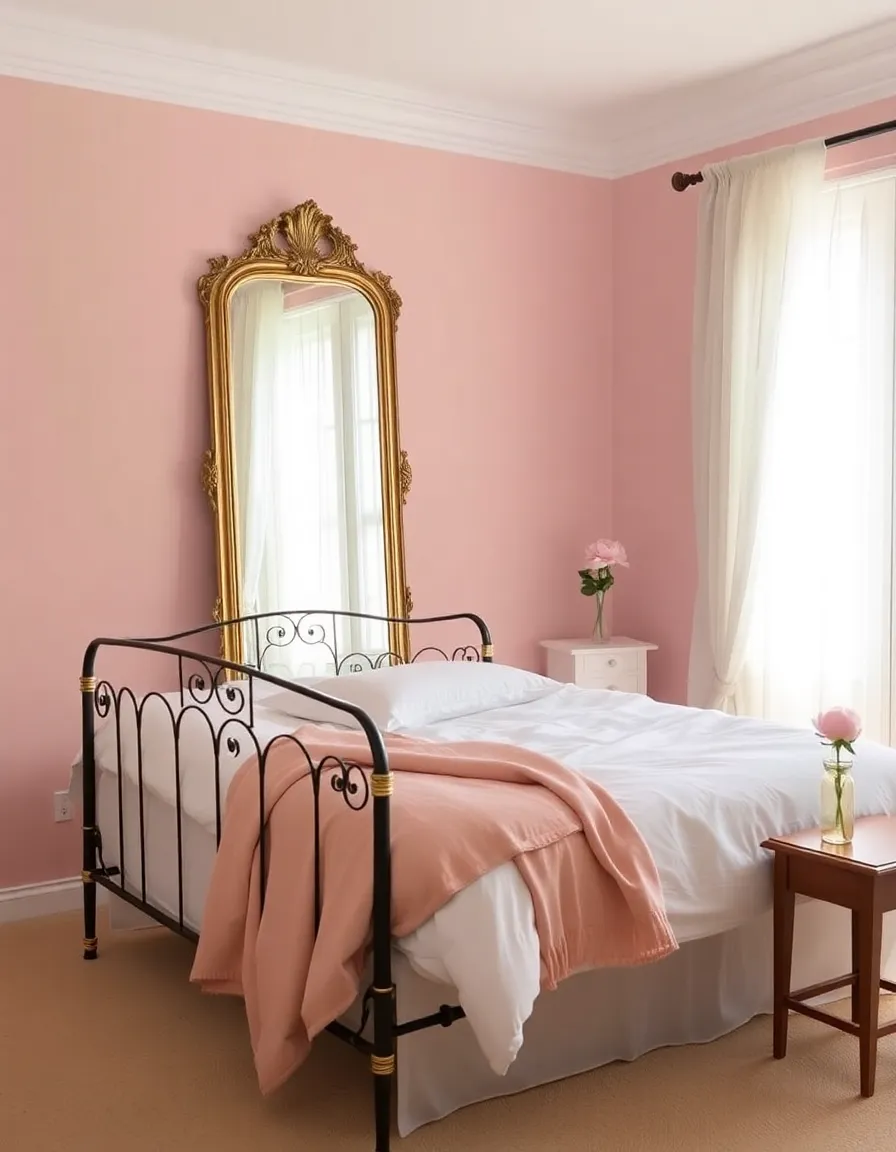
1. The Magic of Blush Pink: Romance in Every Shade
Let’s start with the queen of romantic colors: blush pink. This isn’t your childhood bubblegum pink—oh no. We’re talking about a sophisticated, barely-there hue that whispers elegance rather than screaming “unicorn party.” It’s the color of macarons, Provençal sunsets, and those effortlessly chic French women who somehow make a scarf look like haute couture.
Why does blush pink work so well? It’s warm without being overwhelming, feminine without being saccharine, and it pairs beautifully with just about anything. Imagine it on your walls, layered with crisp white linens and a touch of gold—instant Parisian boudoir vibes. Or, if you’re not ready to commit to painting, try blush pink accents like throw pillows, curtains, or even a vintage rug. Little touches go a long way.
Pro tip: If you’re worried about it feeling too “girly,” balance it out with deeper tones like charcoal gray or rich walnut wood. The contrast keeps it feeling grown-up and intentional. And hey, if anyone side-eyes your pink living room, just tell them it’s très français and sip your espresso smugly.
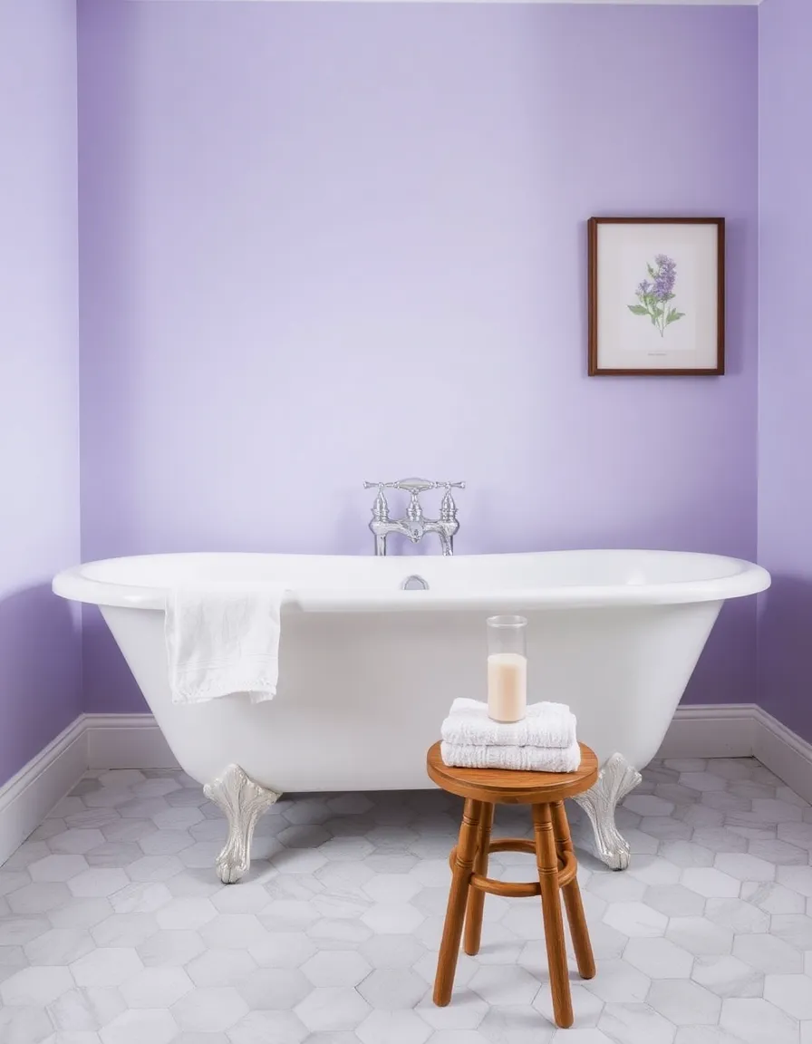
2. Lavender Dreams: Soft Purple Hues for a Serene Escape
Next up: lavender. No, not the stuff your grandma keeps in her sock drawer—though if that’s your vibe, no judgment. We’re talking about the soft, muted lavender that feels like a lazy morning in Provence. It’s calming, a little whimsical, and oh-so-French.
Lavender works wonders in bedrooms or bathrooms where you want to create a tranquil, spa-like atmosphere. Pair it with white or cream for a fresh, airy feel, or mix it with deeper purples and grays for a moodier look. I once painted a tiny bathroom in the palest lavender, and suddenly, my 5-minute showers felt like a luxury getaway. (Okay, maybe not, but it definitely helped.)
If you’re hesitant, start small. Lavender towels, a painted dresser, or even a single accent wall can introduce the color without overwhelming your space. And if anyone asks why your bathroom looks like a field of French lavender, just shrug and say, “C’est la vie.”
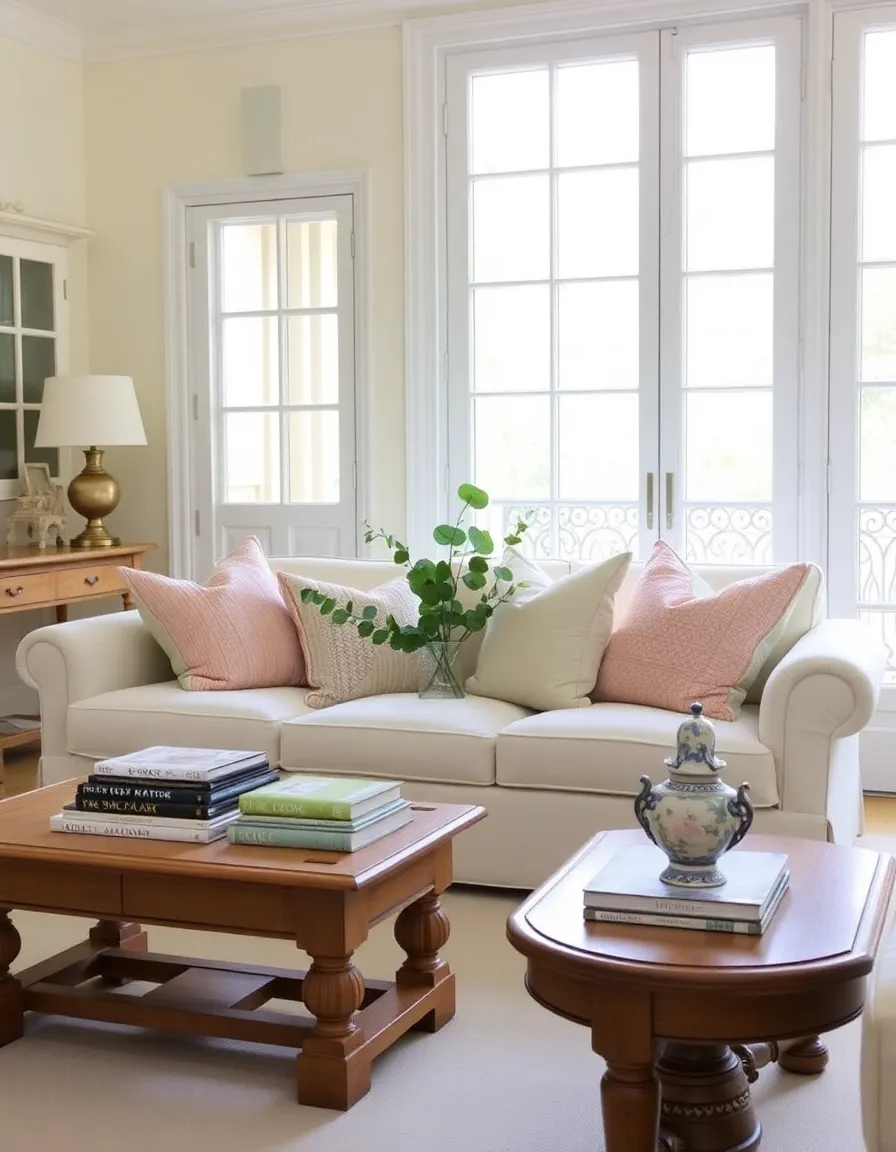
3. Creamy Ivory: The Ultimate French Neutral
If French interiors had a signature color, creamy ivory would be it. This isn’t your basic builder-grade white—it’s warmer, richer, and infinitely more inviting. Think of the walls in a Parisian café or the linen drapes in a countryside château. It’s neutral, but it’s anything but boring.
Ivory is the perfect backdrop for layering other soft colors. It lets your blush pinks, lavenders, and sage greens shine without competing for attention. Plus, it makes any room feel brighter and more spacious—a must if you’re working with a small apartment (or, let’s be real, a closet-sized Parisian flat).
My advice? Use ivory on walls, large furniture pieces, or even flooring (hello, whitewashed hardwood). Then, add texture with linen upholstery, woven baskets, and aged brass hardware. The result? A space that feels collected, timeless, and oh-so-French. And if you spill coffee on it? Just call it “patina.”
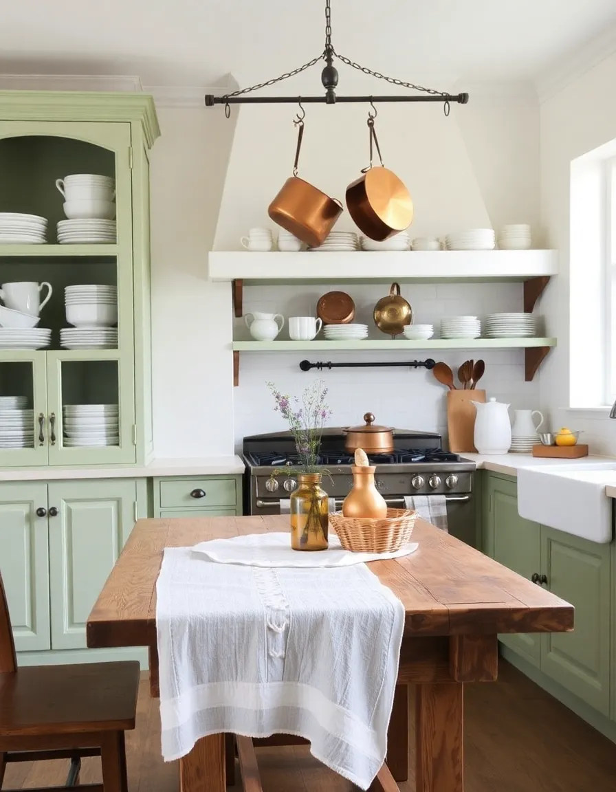
4. Sage Green: A Breath of Fresh Air
Last but not least, let’s talk about sage green—the unsung hero of French color palettes. It’s nature’s neutral, a muted green that feels fresh but never loud. Picture the shutters on a countryside cottage or the leaves of herbs in a French kitchen window. It’s earthy, elegant, and just a little bit rustic (in the best way).
Sage green works beautifully in kitchens, dining rooms, or even home offices. Pair it with white for a crisp, clean look, or mix it with warm woods and rattan for a more organic feel. I painted my kitchen cabinets sage green last year, and now every meal feels like it’s served in a charming bistro. (Even if it’s just microwave ramen. A girl can dream.)
Not ready to paint? Try sage green dishware, table linens, or even a statement piece of furniture. It’s a versatile color that plays well with others, so don’t be afraid to experiment. And if your friends ask why your kitchen looks like it belongs in Provence, just wink and say, “Because I have excellent taste.”
And there you have it—the soft color palettes that’ll give your home that romantic French look without requiring a move across the Atlantic. Whether you go all-in with blush pink walls or just add a few lavender accents, these hues will bring that effortless Parisian charm to your space. Now, if you’ll excuse me, I need to go light a candle, put on some Édith Piaf, and pretend I’m in a tiny flat overlooking the Seine. À bientôt!