![]()
Signature Colors of the Mid-Century Era (Olive, Mustard, Teal & More)

Hey there, fellow mid-century modern fan! If you’ve ever found yourself staring at a vintage sofa or a retro wallpaper sample and thought, “Wow, those colors are something else,” then you’re in the right place. The mid-century era wasn’t just about sleek furniture and atomic-age shapes—it was a full-on color revolution. Olive greens, mustard yellows, teal blues, and a whole palette of other bold hues defined the period, giving homes that unmistakable “Mad Men” vibe (minus the questionable life choices, of course).
Why do these colors still feel so fresh decades later? Maybe it’s because they strike the perfect balance between warmth and sophistication, or maybe it’s because they just make everything look cooler. Either way, I’m here to geek out with you about the signature shades of the mid-century era—where they came from, how they were used, and why they’re still winning design awards in our hearts. So grab your favorite retro-inspired drink (a martini, perhaps?), and let’s dive in.
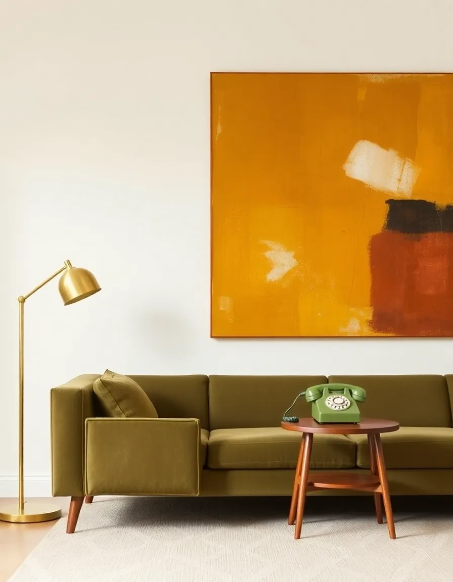
1. Olive Green: The Earthy Sophisticate
Olive green was the mid-century era’s answer to “how do we bring the outdoors in without turning the living room into a jungle?” This muted, earthy tone showed up everywhere—upholstery, kitchen appliances, even those iconic rotary phones. It had a way of feeling both natural and polished, like it belonged in a high-end lounge or a cozy den.
Designers loved olive green because it played well with wood tones (hello, teak and walnut!) and added depth without overwhelming a space. Plus, it had a certain military chic vibe, thanks to its use in wartime uniforms and gear. By the 1950s and ’60s, olive had shed its combat boots and slipped into something more stylish.
Personally, I think olive green is one of those colors that just *works*. It’s not as loud as lime or as safe as sage—it’s the Goldilocks of greens. And let’s be real, it makes brass accents look even more amazing. Win-win.
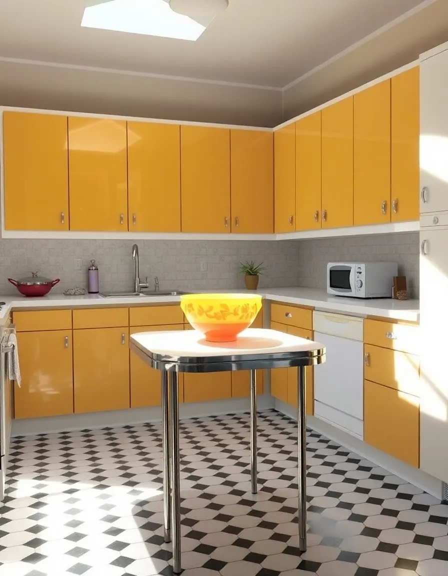
2. Mustard Yellow: The Sunny Showstopper
If olive green is the cool, collected one, mustard yellow is its energetic cousin who shows up to the party wearing a bold patterned shirt. This warm, golden hue was everywhere in mid-century design—kitchens, bathrooms, textiles, you name it. It added a punch of optimism to spaces, like a permanent dose of sunshine.
Mustard yellow worked particularly well with other mid-century staples like burnt orange, chocolate brown, and—you guessed it—teal. It also had a knack for making wood grains pop, which is probably why you’ll see it in so many vintage ads for Danish modern furniture. (Side note: If you’ve ever doubted the power of mustard, try pairing a mustard throw pillow with a dark brown leather chair. Instant magic.)
Now, I know what you’re thinking: “Isn’t mustard yellow kind of… loud?” Sure, it’s not for the faint of heart. But when used strategically—say, on an accent wall or a statement chair—it brings just the right amount of drama. And let’s face it, life’s too short for boring colors.
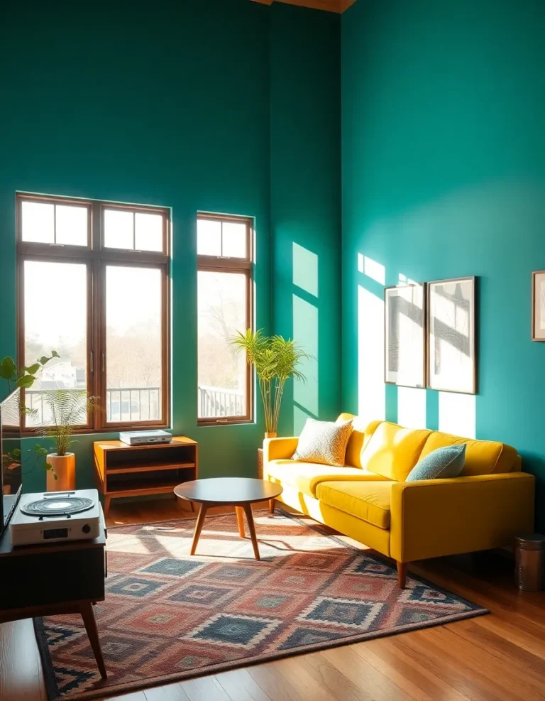
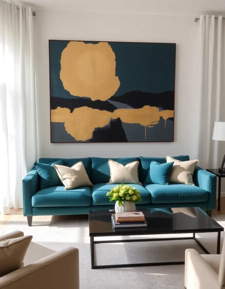
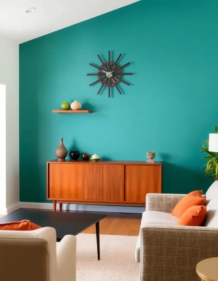
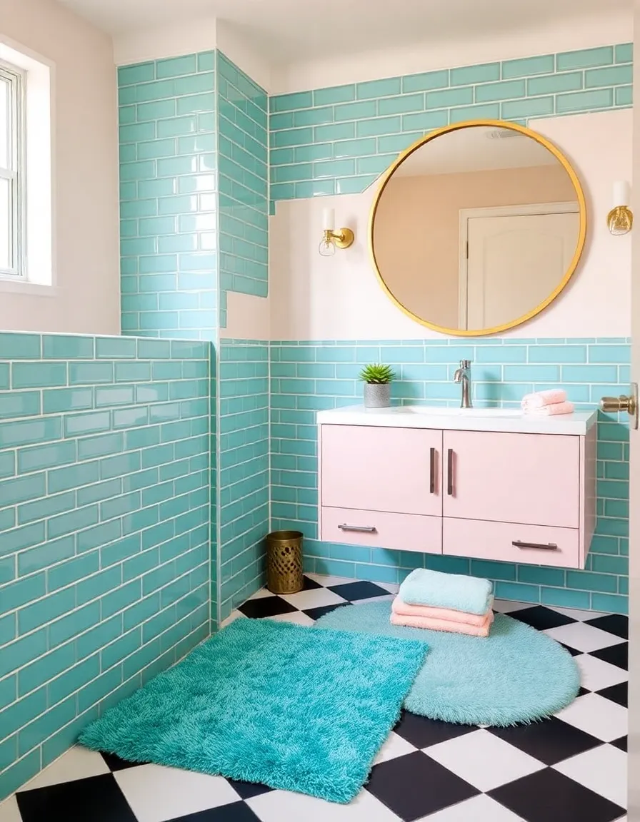
3. Teal: The Cool Kid of the Palette
Ah, teal. The color that somehow manages to be both retro and timeless. This blue-green hybrid was a mid-century darling, showing up in bathrooms, upholstery, and even those fabulous atomic-age wall clocks. It had a way of feeling fresh and futuristic, like it belonged in a spaceship—or at least a very stylish suburban home.
Teal’s versatility was its superpower. Pair it with white for a crisp, clean look, or mix it with warm tones like mustard and rust for a bolder statement. It also played nicely with pink (yes, really), creating those iconic “Jetsons”-inspired combos that still make us swoon. I once stumbled upon a vintage teal typewriter at a flea market, and let me tell you, it took every ounce of self-control not to buy it on the spot.
What makes teal so enduring? Maybe it’s the way it evokes tropical waters and vintage travel posters. Or maybe it’s just that perfect balance of calm and vibrancy. Either way, it’s a color that never goes out of style—even if your grandma’s bathroom tile begs to differ.
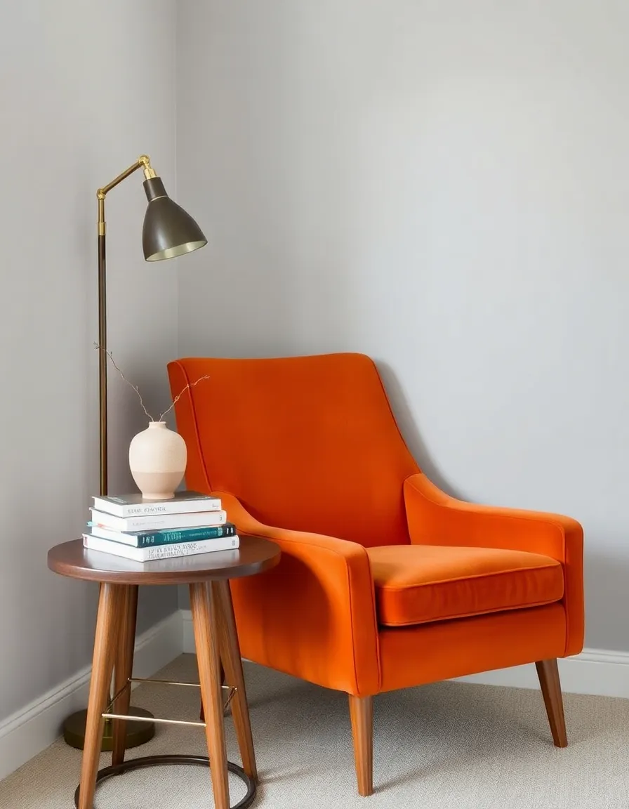
4. Burnt Orange: The Spicy Accent
If the mid-century palette had a flavor, burnt orange would be the zesty kick that takes it to the next level. This rich, spicy hue was everywhere—from shag carpets to ceramic tableware—and it brought warmth to even the most minimalist spaces. It was like autumn in a color, but without the pumpkin spice overload.
Burnt orange had a knack for making other colors shine. Pair it with olive green for a earthy, organic feel, or mix it with teal for a bold contrast that’s straight out of a 1960s ad campaign. And let’s not forget its starring role in those iconic Herman Miller chairs. (If you’ve ever sat in an Eames lounge chair in burnt orange leather, you know what I’m talking about.)
Now, I’ll admit, burnt orange isn’t the easiest color to decorate with. Go overboard, and your living room might start resembling a fast-food chain. But used in moderation—think throw pillows, a single accent wall, or a statement lamp—it adds just the right amount of retro warmth. Plus, it’s basically Halloween decor year-round. Bonus?
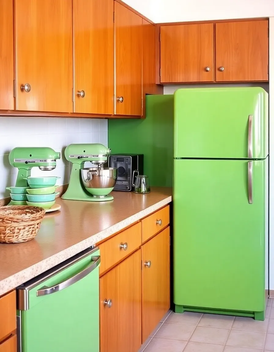
5. Avocado Green: The Love-It-or-Hate-It Classic
Ah, avocado green. The color that defined an entire generation of appliances and sparked countless debates. Some people adore it for its nostalgic charm; others… well, let’s just say they’d rather forget their grandma’s fridge. But love it or hate it, you can’t talk about mid-century colors without giving avocado its due.
This creamy, yellow-green hue was the epitome of “modern” in the 1960s and ’70s, showing up in everything from refrigerators to bathroom tiles. It had a way of feeling fresh and organic, like the perfect ripe avocado (hence the name). And when paired with harvest gold and burnt orange, it created that quintessential “retro kitchen” look we all know and… maybe love?
Personally, I think avocado green gets a bad rap. Sure, it’s not the most versatile color, but when used in the right context—say, a vintage-inspired bar cart or a funky accent wall—it’s downright delightful. Plus, it’s basically a conversation starter. “Oh, that? It’s an authentic 1972 avocado-green blender. Works like a charm.” Instant cred.
So there you have it—the signature colors of the mid-century era, broken down for your decorating pleasure. Whether you’re a die-hard retro enthusiast or just dipping your toes into vintage-inspired design, these hues offer endless inspiration. And the best part? They’re just as relevant today as they were 60 years ago. So go ahead, embrace that olive-green sofa or that teal accent wall. Your home (and your inner Don Draper) will thank you.