![]()
How to Pair Mid-Century Colors with Modern Neutrals

Hey there, fellow design lover! If you’re anything like me, you’ve probably spent way too much time scrolling through Pinterest, drooling over those dreamy mid-century modern interiors. The bold colors, the sleek lines, the effortless cool—it’s enough to make anyone want to redecorate their entire home. But here’s the thing: while mid-century colors are undeniably gorgeous, they can feel a little… intense when paired with, well, more of the same. That’s where modern neutrals come in.
Think of modern neutrals as the ultimate wingman for your mid-century palette. They tone down the vibrancy just enough to keep things fresh and livable without sacrificing that iconic retro charm. And the best part? You don’t have to be an interior design pro to pull it off. Whether you’re a renter working with a beige box or a homeowner ready to dive into a full-blown makeover, I’ve got you covered. Let’s break it down.
1. Understanding Mid-Century Color Psychology
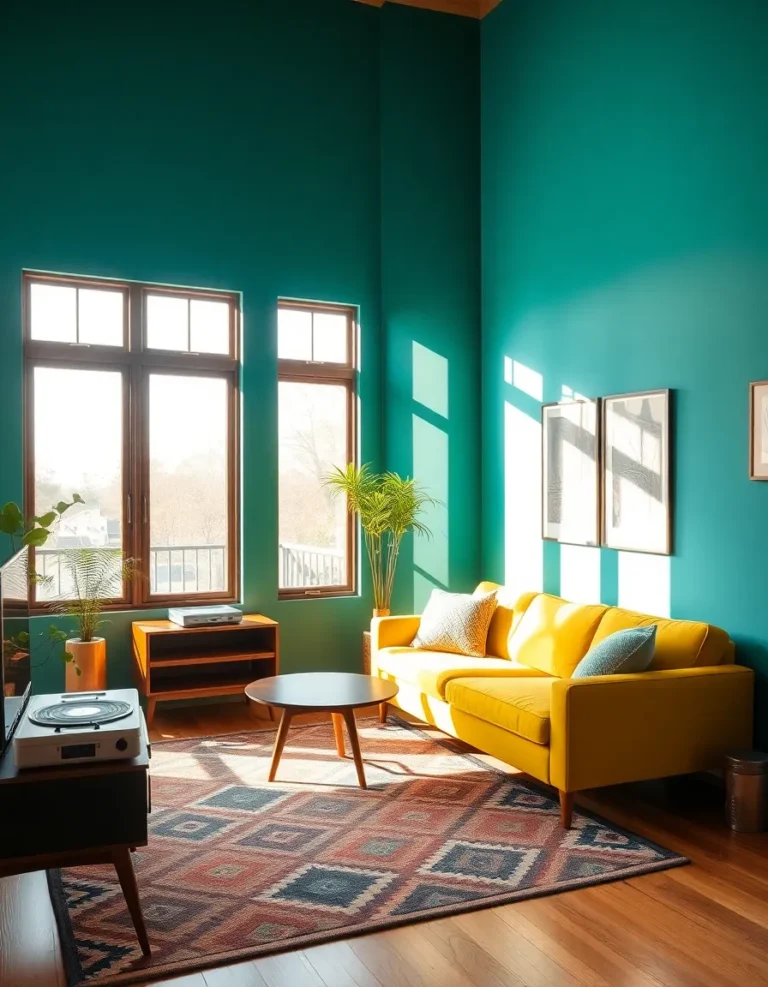
Before we start slapping paint samples on the wall, let’s take a quick trip back to the 1950s and 60s. Mid-century design wasn’t just about looking good—it was a rebellion against the stuffy, overly ornate styles of the past. Designers like Eames and Saarinen weren’t afraid to go bold, using colors to evoke emotion and energy. Mustard yellows? Optimism. Teal blues? Tranquility. That burnt orange you’ve been eyeing? Pure warmth and creativity.
But here’s the catch: these colors weren’t meant to exist in a vacuum. They played off each other and against neutral backdrops to create balance. So if you’re worried about your living room looking like a retro diner, don’t panic. The secret is in the pairing.
Ever notice how mid-century ads and interiors often featured crisp whites or soft grays alongside those punchy hues? That’s not an accident. Those neutrals gave the eye a place to rest, preventing sensory overload. And guess what? The same principle applies today.
2. Choosing the Right Modern Neutrals
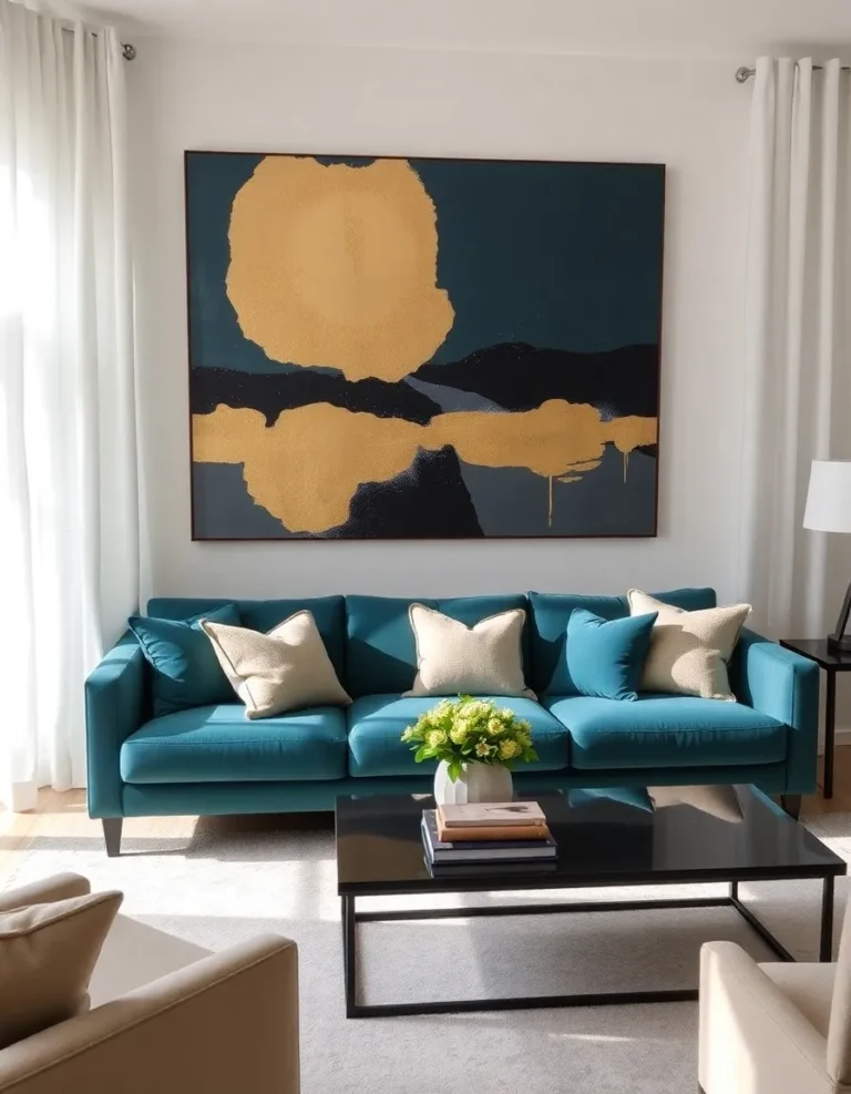
Alright, let’s talk modern neutrals—because not all beiges are created equal. The mid-century look leans warm, so your best bets are:
- Warm whites: Think Swiss Coffee or Alabaster—creamy without veering into yellow.
- Soft grays: Go for greige (gray + beige) to keep things cozy.
- Natural woods: Light oak or walnut add organic texture.
- Black accents: Used sparingly, they ground the space.
Now, here’s where I made a mistake in my first apartment: I paired a gorgeous emerald green sofa with cold, stark white walls. It looked like a Christmas decoration threw up in a hospital. Lesson learned! The warmth of your neutrals matters just as much as the color itself.
Pro tip: Grab a few paint swatches and hold them up next to your mid-century color of choice. If the combo makes you think of a Wes Anderson film (in a good way), you’re golden. If it reminds you of a corporate office, back away slowly.
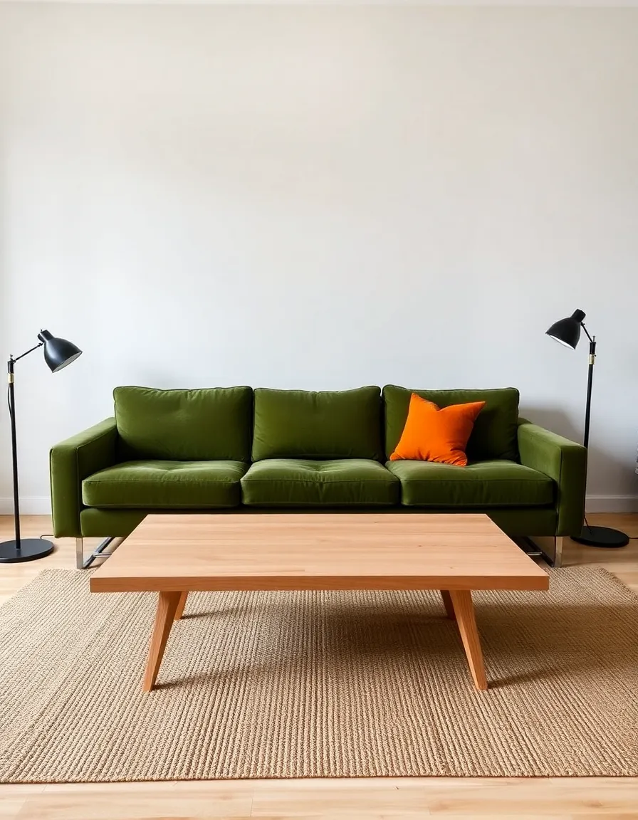
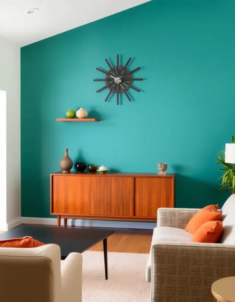
3. The 60-30-10 Rule (Your New Best Friend)
If you’ve ever wondered why some rooms just *work* while others feel chaotic, chances are they’re following the 60-30-10 rule. Here’s the breakdown:
- 60% dominant neutral: Walls, large furniture, flooring.
- 30% secondary color: Mid-century hue (sofa, curtains, etc.).
- 10% accent: A contrasting pop (think burnt orange throw pillows on a teal couch).
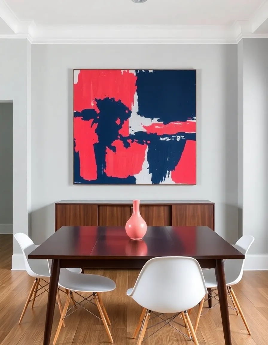
In my dining room, I used pale gray walls (60%), a walnut table and chairs (30%), and persimmon-colored napkins and art (10%). It’s enough color to feel fun but not so much that guests need sunglasses. The beauty of this system? It works whether you’re going full retro or just adding a few vintage touches.
And hey, rules are made to be broken—but maybe master this one first before you start channeling your inner Picasso, okay?
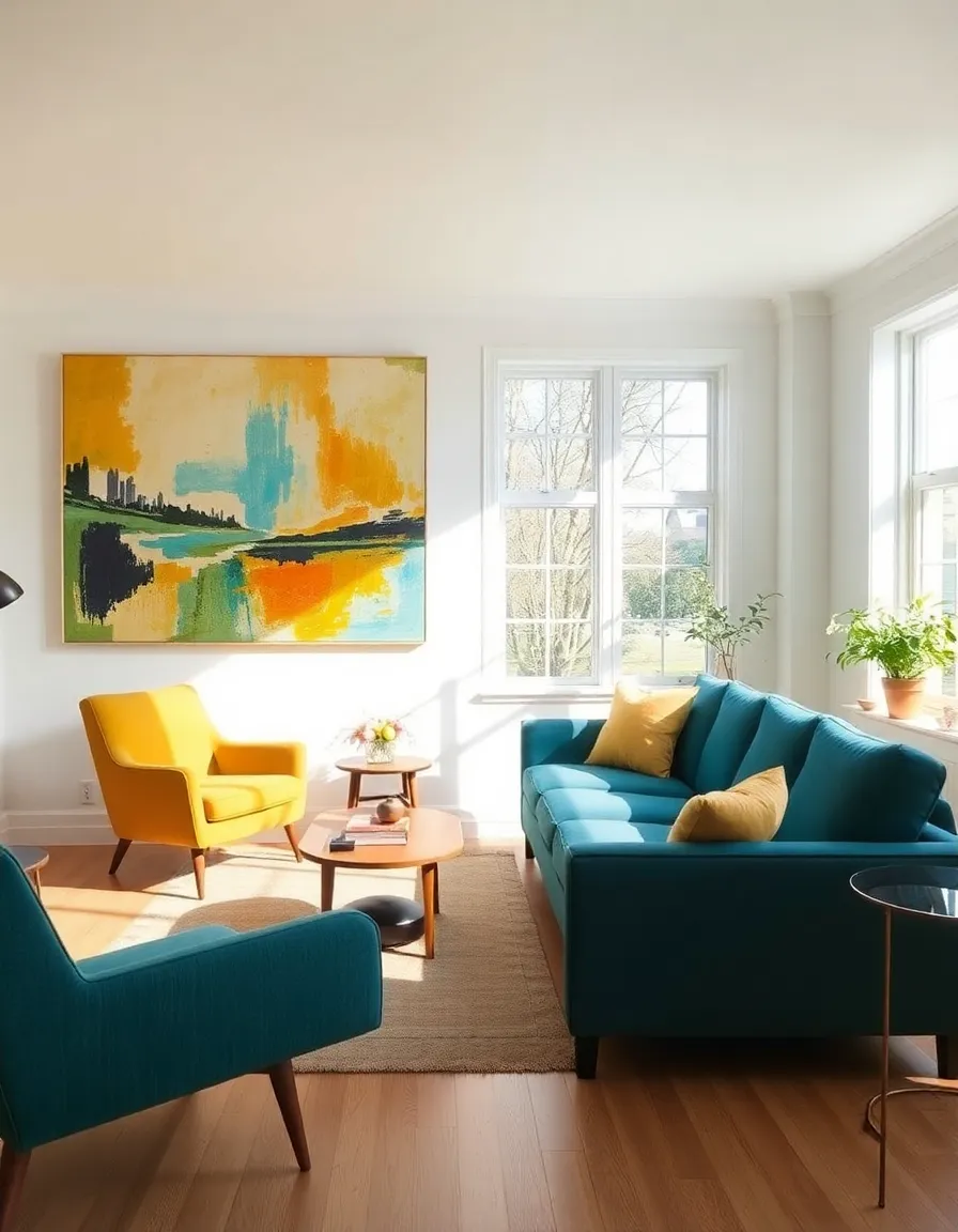
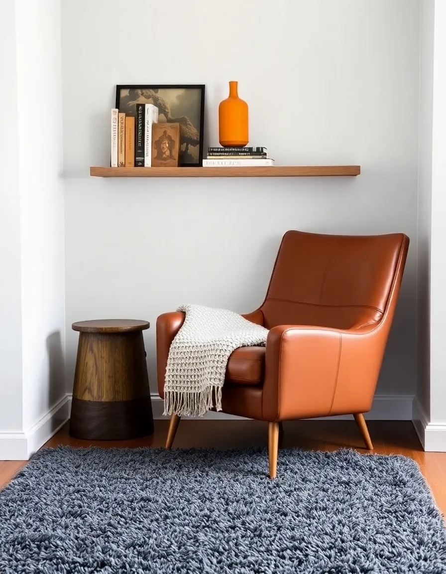
4. Texture: The Secret Weapon
Here’s something they don’t tell you in design school: color is only half the battle. Texture is what keeps a neutral-and-bold combo from falling flat. Mid-century design loved mixing materials—smooth leather, nubby wool, shiny metal—and we should too.
Try pairing a sleek, neutral-colored sofa with a chunky knit throw in a muted mid-century tone. Or balance a glossy retro sideboard with a rough-hewn wooden bowl. The contrast keeps things interesting without adding visual clutter.
My personal favorite trick? A shag rug in a neutral tone under a brightly colored coffee table. It’s like a hug for your feet while your eyes do the happy dance. Plus, it’s way cheaper than therapy.
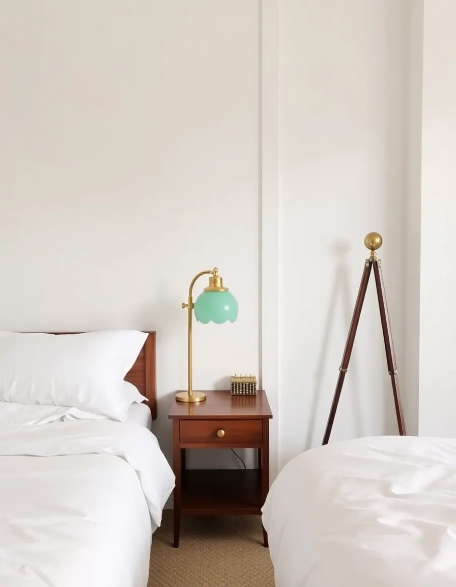
5. Lighting: Setting the Mood
Nothing kills a vibe faster than harsh overhead lighting (looking at you, apartment fluorescents). Mid-century design was all about layered lighting, and your color scheme will thank you for continuing the tradition.
Here’s the lighting trifecta for modern-meets-retro spaces:
- Ambient: Warm white bulbs in a simple ceiling fixture.
- Task: A sculptural table lamp in a neutral base with a colorful shade.
- Accent: A statement floor lamp (may I suggest a Sputnik chandelier for drama?).
In my bedroom, I have a creamy white pendant light, a brass reading lamp with an avocado green shade (don’t judge—it’s amazing), and tiny plug-in wall sconces that make the whole room glow. The colors feel richer, the neutrals feel cozier, and I finally understand why lighting designers get paid the big bucks.
6. When to Break the Rules
Okay, confession time: sometimes I wake up and think, “Screw it, I’m painting my kitchen cabinets sunflower yellow.” And you know what? Sometimes that’s exactly what you should do. While all these tips are great starting points, design should ultimately make you happy.
If you’re obsessed with a particular mid-century color but can’t figure out how to balance it, try these cheats:
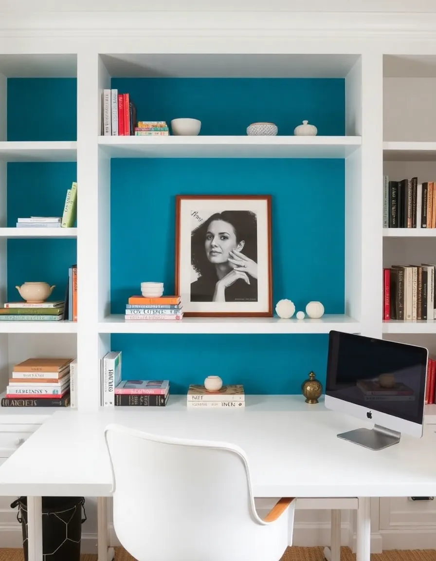
- Use it in small, unexpected places (inside a bookshelf, the back of a door).
- Pair it with black and white instead of warmer neutrals for a graphic look.
- Go monochromatic with varying shades of the same hue.
At the end of the day, your home should reflect your personality—not just some design blogger’s rules (yes, I see the irony). So if you want a neon pink accent wall with your beige couch, you do you, boo. Just maybe test it with temporary wallpaper first.
So there you have it—everything I’ve learned (often the hard way) about pairing mid-century colors with modern neutrals. The key takeaway? Have fun with it. Mix and match until it feels right to you. And if all else fails, remember: plants make everything look better. Now go forth and make your space as awesome as you are!