Best Paint Brands and Swatches for Authentic Mid-Century Tones
Hey there, fellow mid-century modern lover! If you’re anything like me, you’ve spent way too much time scrolling through Pinterest, drooling over those perfectly curated living rooms with their warm, earthy tones and pops of retro color. But here’s the kicker—finding the right paint to recreate that vibe? It’s harder than convincing your cat to take a bath. But don’t worry, I’ve got your back.
Whether you’re restoring a vintage gem or just want to sprinkle some mid-century magic into your space, the right paint can make all the difference. And let’s be real—nothing ruins a vibe faster than a shade that’s just… off. So, let’s dive into the best paint brands and swatches that nail those authentic mid-century tones. Trust me, your walls will thank you.
1. Why Mid-Century Tones Are a Big Deal (And Not Just for Your Grandma’s House)
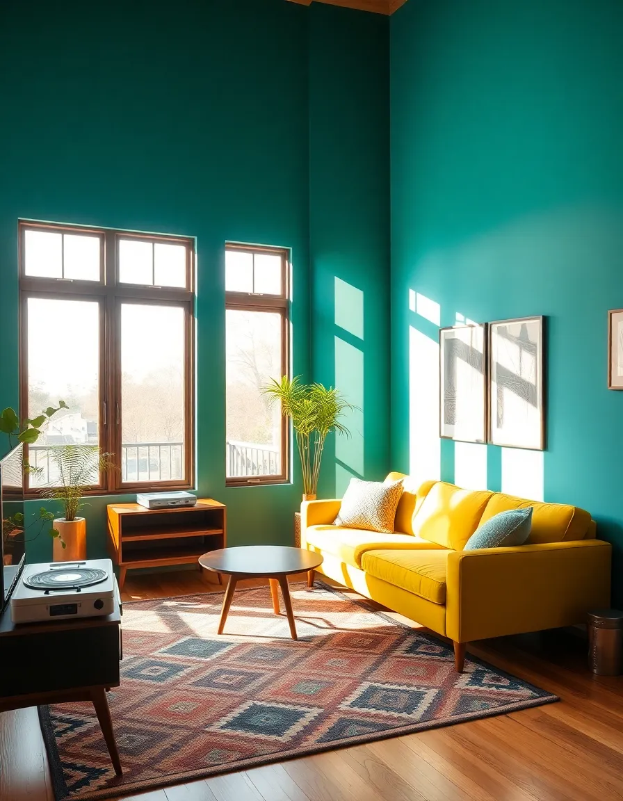
First things first—why are we even obsessing over mid-century colors? Well, because they’re timeless. These aren’t your run-of-the-mill neutrals or flashy trends that’ll look dated in a year. We’re talking about rich, organic hues that feel cozy yet sophisticated. Think mustard yellows, olive greens, teals, and burnt oranges—colors that make you want to pour a martini and lounge in an Eames chair.
But here’s the catch: not all paint brands get it right. Some lean too neon, others too muddy. And if you’ve ever picked a color that looked perfect on the swatch but turned into a horror show on your wall, you know the struggle. So, let’s skip the trial-and-error phase and go straight to the good stuff.

2. The Best Paint Brands for Authentic Mid-Century Vibes
Not all paint brands are created equal, especially when it comes to nailing those retro tones. Here are my top picks—brands that actually understand the assignment:
Sherwin-Williams: The Mid-Century MVP
Sherwin-Williams has a knack for historical colors, and their mid-century palette is *chef’s kiss*. I used “Rookwood Dark Red” in my own home, and it’s the perfect deep, moody burgundy that doesn’t veer into gothic territory. Their formulas are also super durable, which is great if you have kids (or pets) who treat your walls like a canvas).
Farrow & Ball: The Luxury Option
If you want your walls to look like they belong in a design magazine, Farrow & Ball is your go-to. Their “India Yellow” is a dreamy, muted mustard that screams 1960s chic. Yes, it’s pricey, but the depth of color is unmatched. Just don’t blame me when you start eyeing their entire catalog.
Benjamin Moore: The Reliable Workhorse
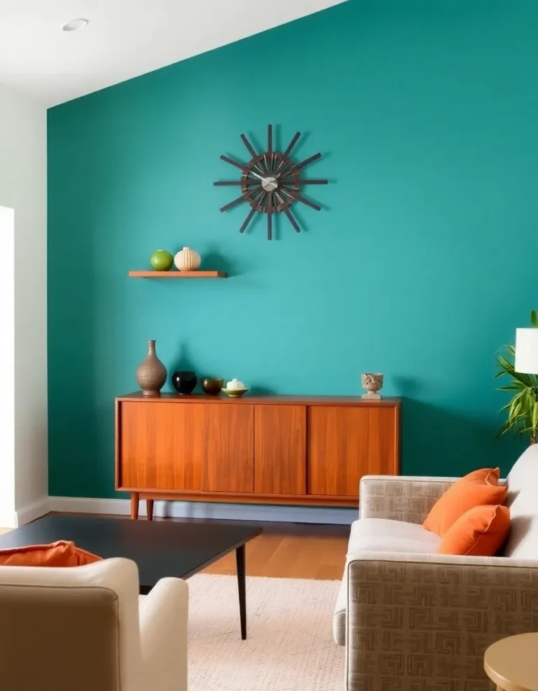
Benjamin Moore’s “Mediterranean Teal” is a fan favorite for a reason—it’s the ideal balance of bold and soothing. Plus, their paint goes on like butter, which is a lifesaver if you’re DIY-ing (because who has the budget for professional painters these days?).
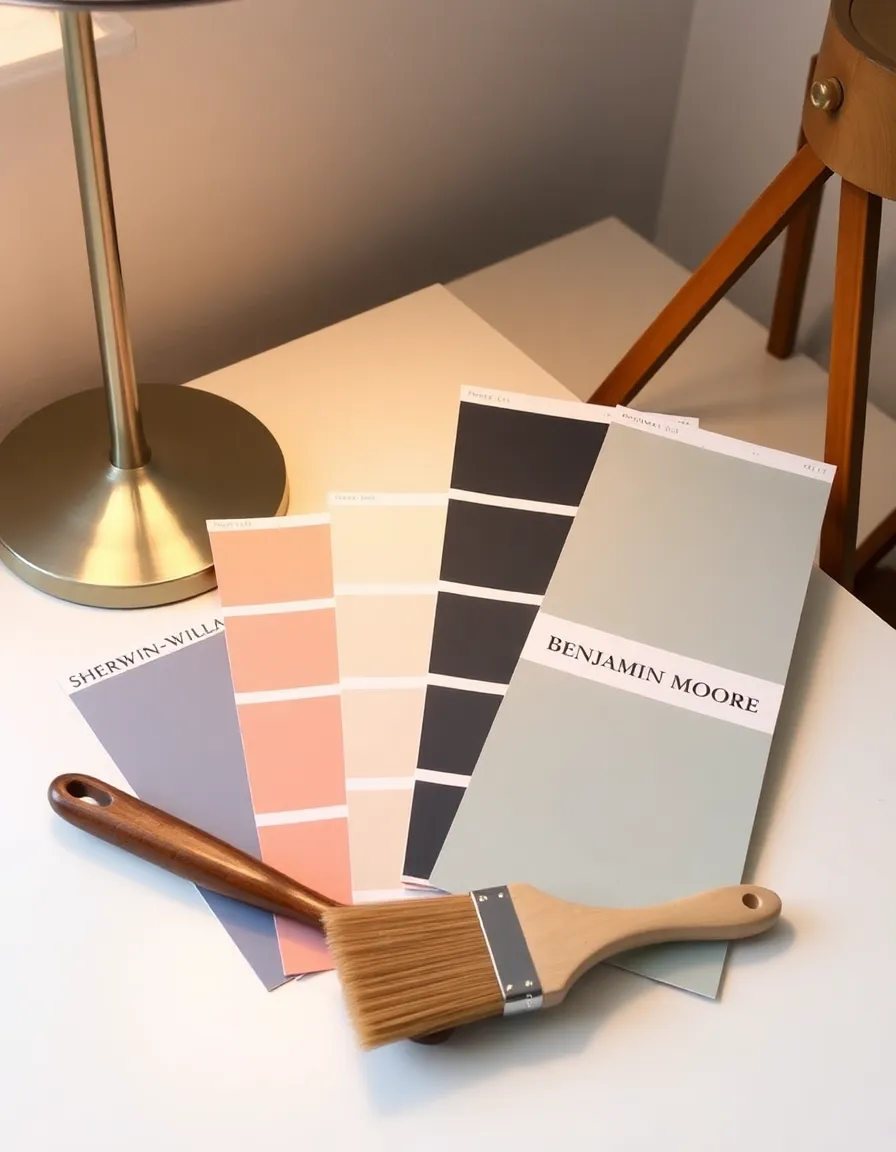
3. Must-Have Mid-Century Swatches You Need to Try
Okay, now for the fun part—actual colors! Here are my top swatches that’ll give you instant mid-century cred:
- Sherwin-Williams “Avocado”: No, not the ’70s appliance nightmare. This is a sophisticated, earthy green that pairs perfectly with walnut furniture.
- Farrow & Ball “Hague Blue”: A deep, moody blue-green that feels like it belongs in a Palm Springs bungalow.
- Benjamin Moore “Burnt Henna”: A spicy, terracotta-esque orange that’s bold without being overwhelming.
Pro tip: Always test swatches in your space before committing. Lighting can play tricks on you, and the last thing you want is a room that looks like a pumpkin patch gone wrong.
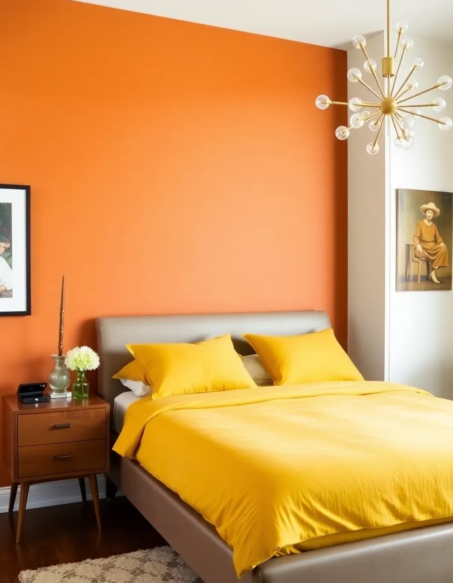
4. How to Pair Mid-Century Colors Like a Pro
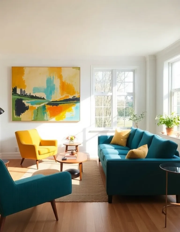
Now that you’ve got your colors, how do you make them work together without your home looking like a crayon box? Here’s the secret: balance. Mid-century design thrives on contrast—warm tones with cool, bold with neutral.
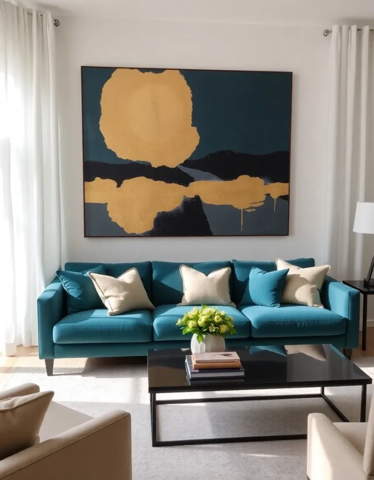
For example, pair a rich teal with warm wood tones and a crisp white ceiling. Or go for a monochromatic look with varying shades of olive green. And if you’re feeling adventurous, throw in a pop of atomic-age pink. Just remember: less is more. You want your space to feel curated, not chaotic.
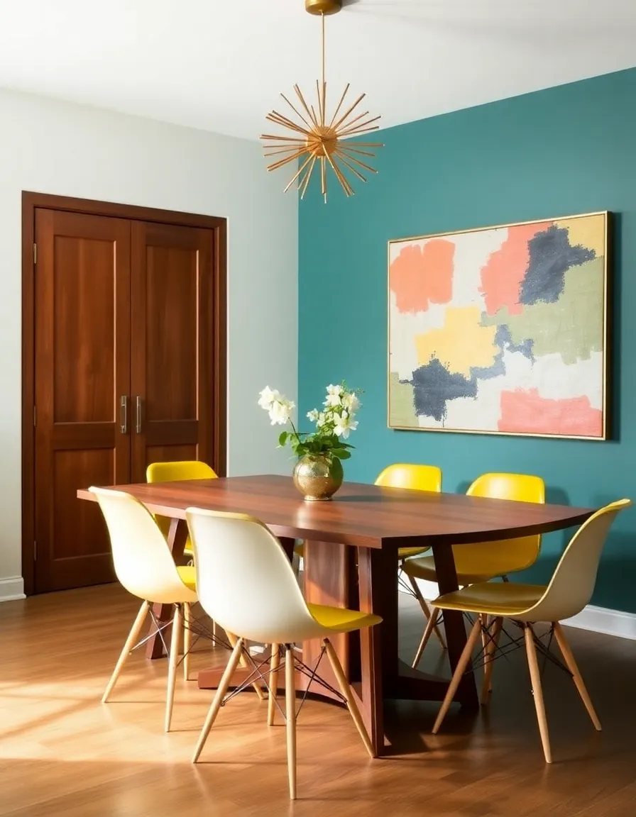
5. Final Tips for Nailing the Mid-Century Look
Before you grab that paint roller, here are a few last nuggets of wisdom:
- Don’t forget the trim: Mid-century homes often used contrasting trim colors. Try a creamy off-white or even black for extra drama.
- Embrace texture: Pair your paint with natural materials like wood, leather, and stone to keep things authentic.
- Lighting matters: Mid-century design is all about warm, ambient light. Swap out harsh overhead lights for vintage-inspired fixtures.
And most importantly—have fun with it! Your home should reflect your personality, whether that means going full-on retro or just adding subtle nods to the era.
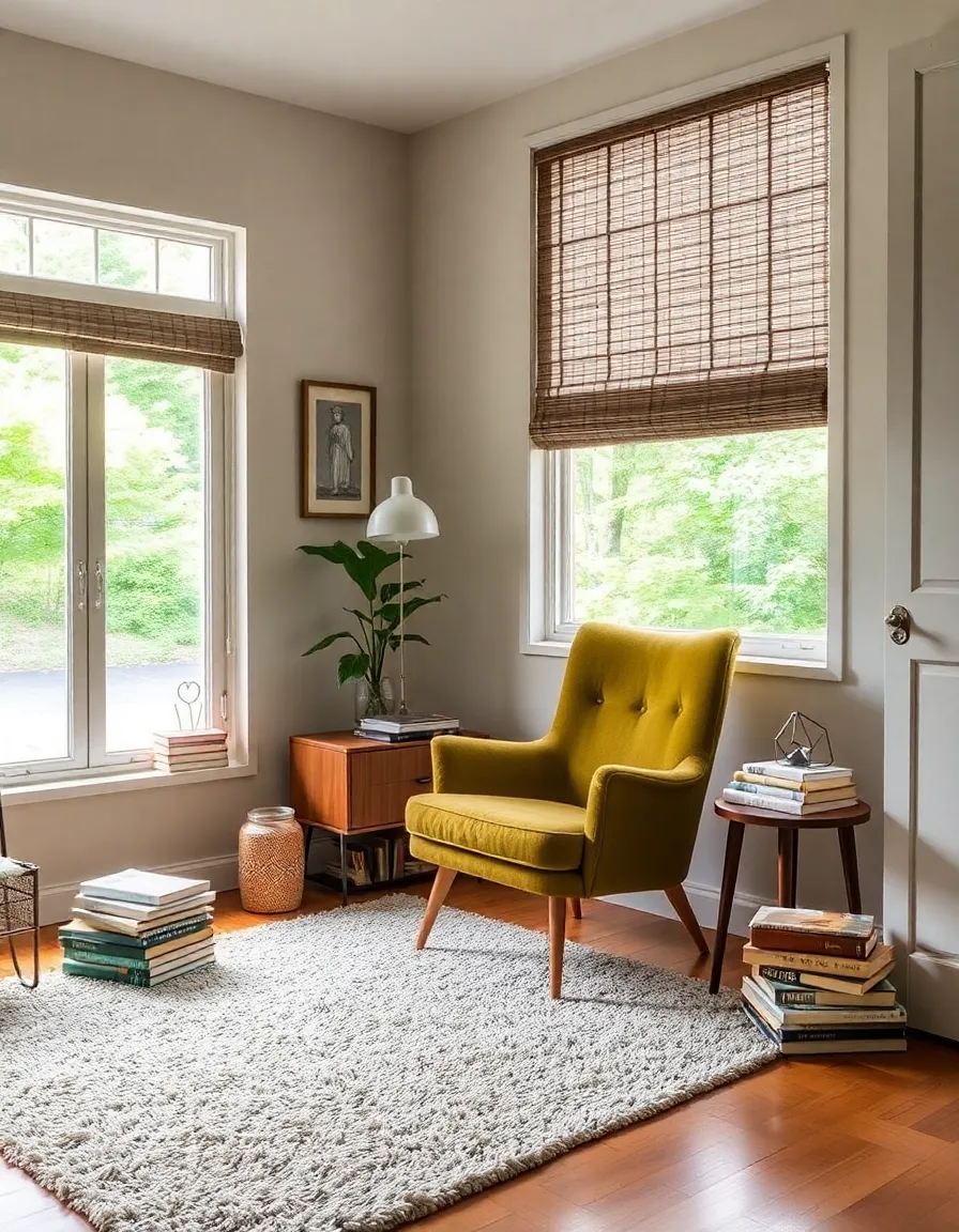
So there you have it—your ultimate guide to mid-century paint perfection. Now go forth and transform your space into the retro haven of your dreams. And if you end up painting your entire house avocado green… well, I won’t judge. (Okay, maybe a little.) Happy painting!

