![]()
Balancing Bold Colors with Neutrals for a Fresh Look

Hey there, color lover! Ever walked into a room and felt like it punched you in the face with its boldness? Or maybe it whispered so softly with neutrals that you almost fell asleep standing up? Yeah, we’ve all been there. The secret to nailing that perfect, fresh look isn’t about going full-on rainbow or drowning in beige—it’s about balance. And trust me, once you get the hang of pairing bold colors with neutrals, your space will feel like it got a caffeine boost without the jitters.
Think of your room like an outfit. You wouldn’t wear a neon green blazer with polka-dot pants (unless you’re at a very specific party, in which case, go off). Instead, you’d balance that statement piece with something understated. The same goes for your home. Bold colors bring energy, personality, and a whole lot of drama, while neutrals keep things grounded and sophisticated. Together? Magic. Let’s dive into how to make that magic happen without accidentally creating a visual tornado.
1. Start with a Neutral Base
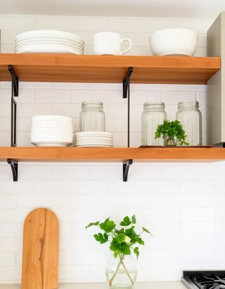
Before you go wild with that emerald green or fiery coral, lay down a neutral foundation. Think of it as the calm before the storm—or in this case, the storm of fabulousness you’re about to unleash. Whites, creams, grays, and taupes are your best friends here. They’re like the reliable sidekick in every superhero movie: not always the flashiest, but absolutely essential.
Why? Because neutrals give your bold colors room to breathe. They prevent your space from feeling like a circus tent (unless that’s your vibe, no judgment). Plus, they make it easier to switch up your accent colors later. Love mustard yellow today but obsessed with deep teal tomorrow? A neutral base lets you swap without repainting your entire life.
Pro tip: If you’re afraid of going too sterile, warm up your neutrals with textures. A chunky knit throw, a woven rug, or even a leather chair can add depth without stealing the spotlight from your bold accents.
2. Pick Your Bold Color Wisely
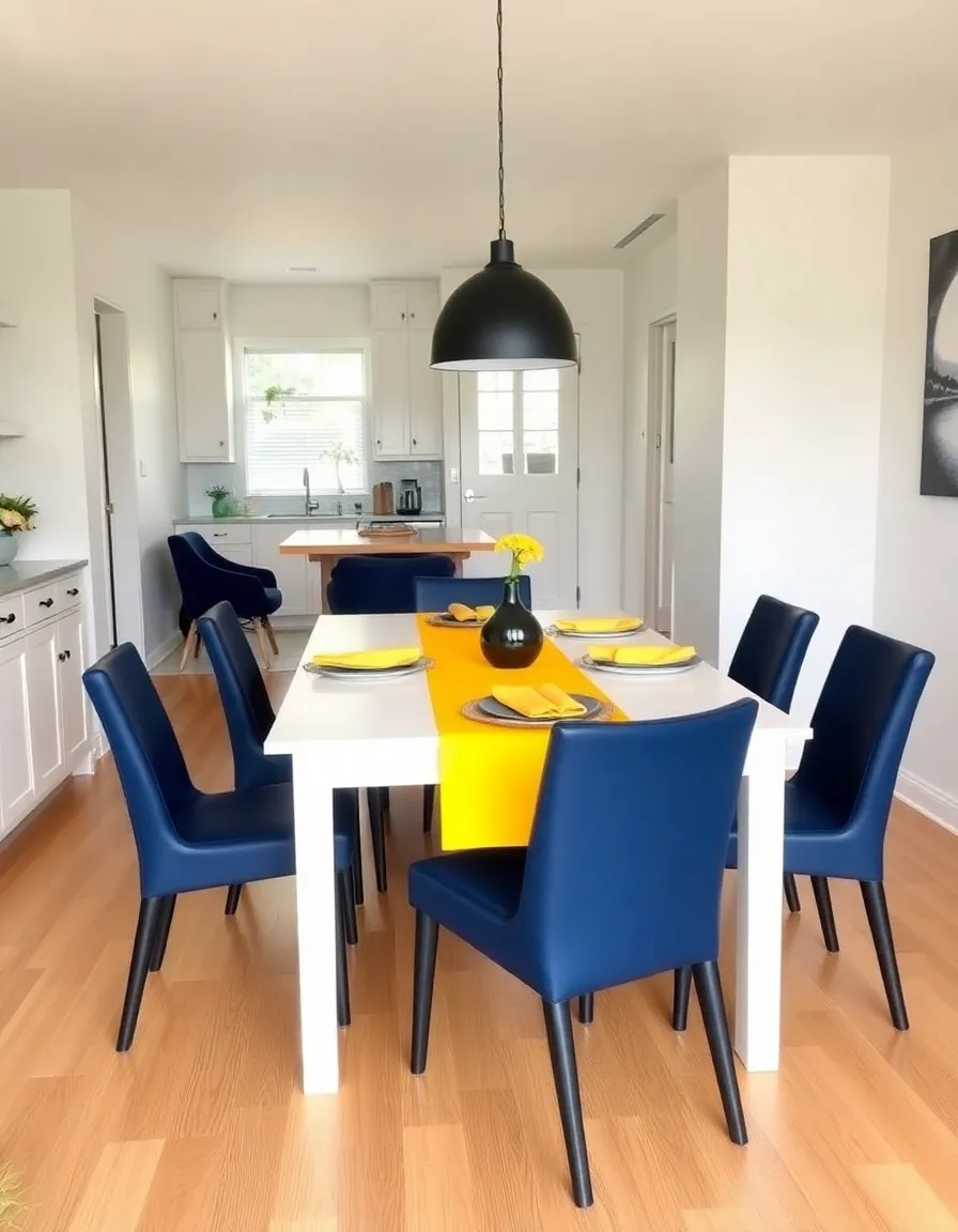
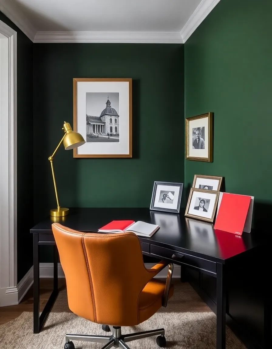
Not all bold colors are created equal. Some scream “look at me!” while others whisper it seductively. The key is choosing a shade that speaks to you without giving your guests a headache. IMO, jewel tones (think sapphire, ruby, or amethyst) are a safe bet—they’re rich but still sophisticated. On the other hand, neon pink might be a harder sell unless you’re going for a retro diner aesthetic.
Consider the mood you want, too. Deep blues and greens feel calming yet dramatic, while fiery reds and oranges bring energy. And hey, if you’re feeling adventurous, why not mix a few? Just remember: one or two bold colors max unless you’re aiming for maximalism (which, FYI, is a whole other conversation).
Personal anecdote time: I once painted an accent wall in what I thought was a “moody plum.” Turns out, it was more “unicorn vomit purple” under certain lighting. Lesson learned: always test your colors in the actual room before committing. Your future self will thank you.
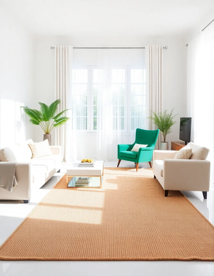
3. Use the 60-30-10 Rule
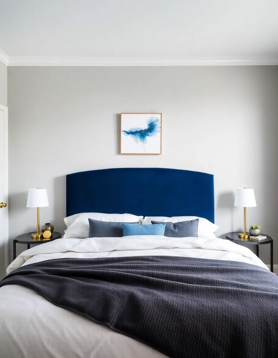
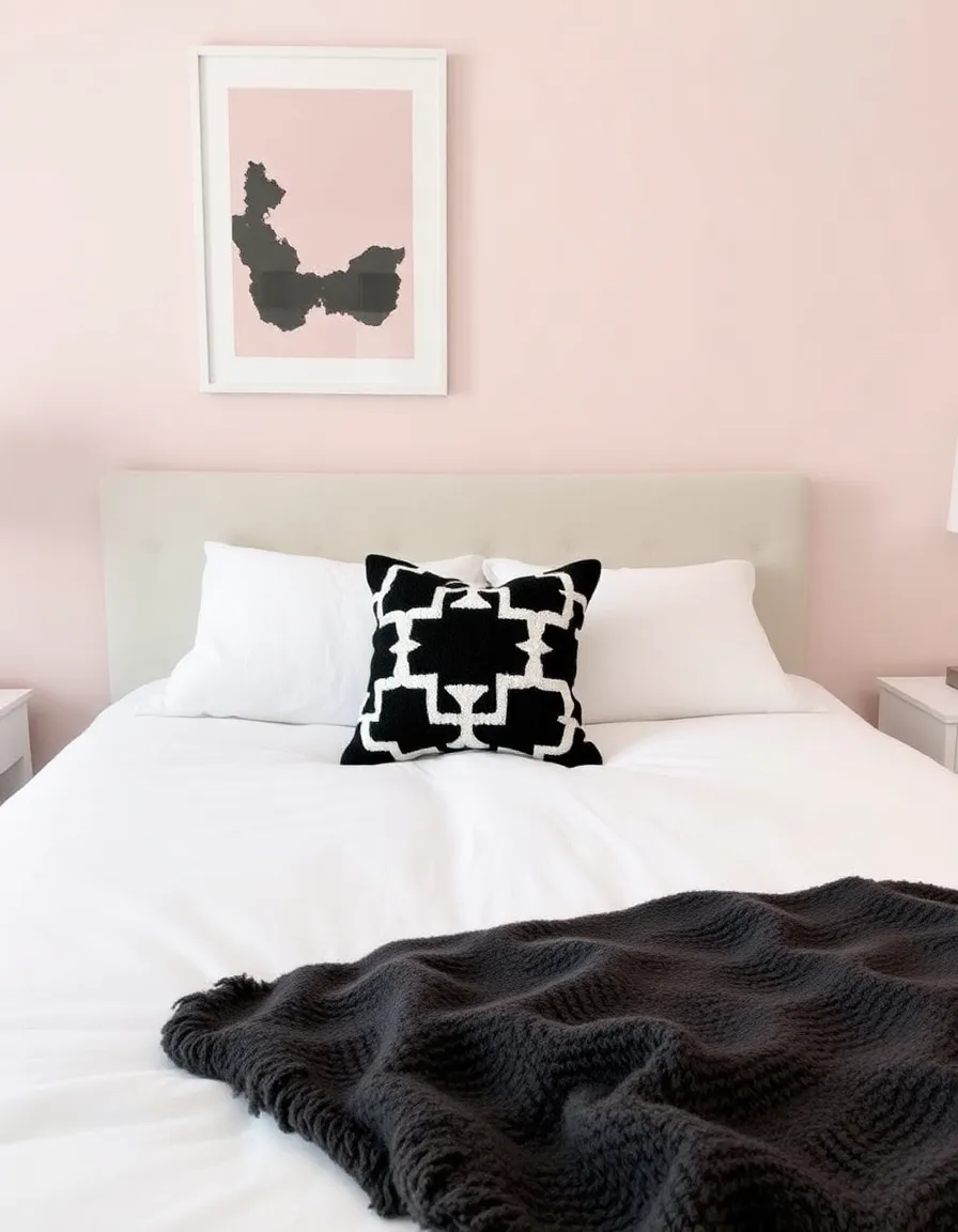
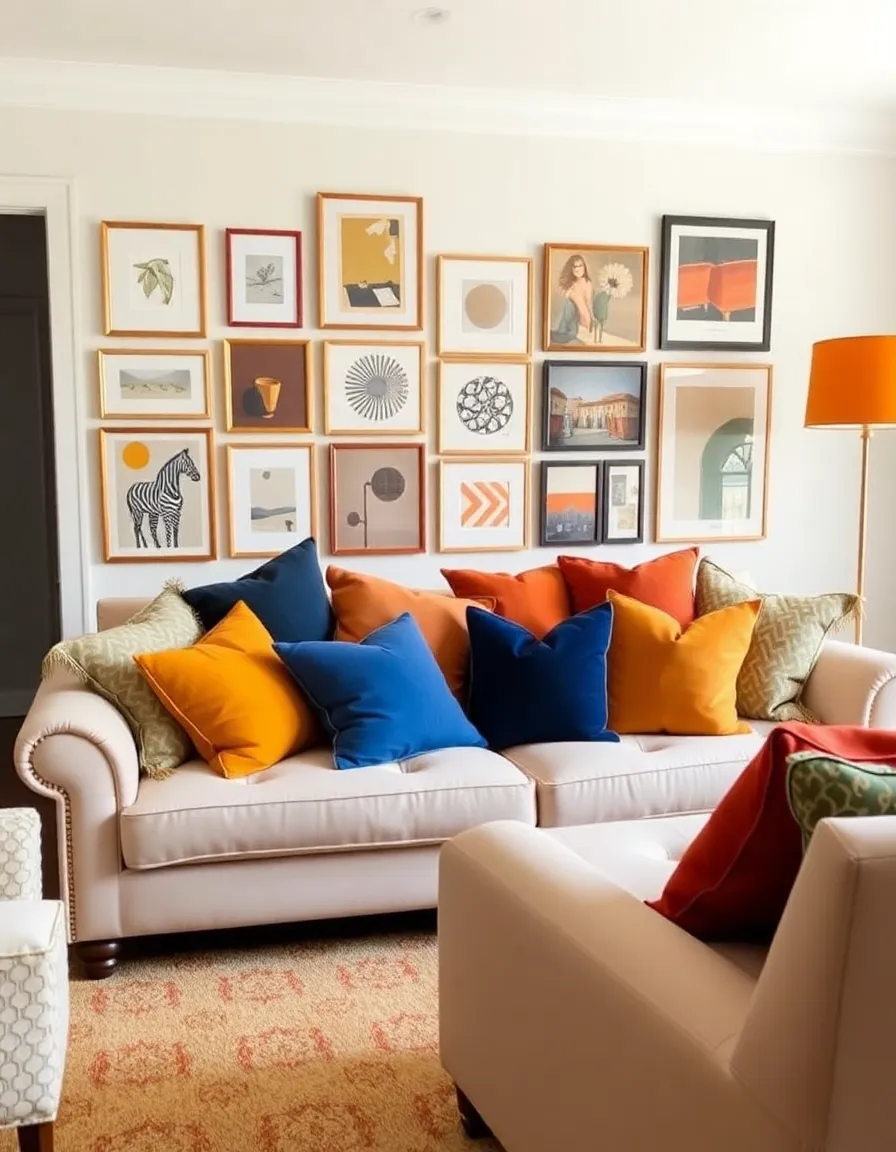
Ever heard of the 60-30-10 rule? It’s like the golden ratio for design, but way less math-y. Here’s how it works: 60% of your room should be neutral (walls, big furniture), 30% a secondary color (upholstery, curtains), and 10% your bold pop (pillows, art, or that funky lamp you couldn’t resist). This keeps things balanced without feeling rigid.
For example, picture a living room with beige walls (60%), a charcoal gray sofa (30%), and vibrant coral throw pillows and a matching vase (10%). The coral doesn’t overwhelm, but it definitely makes a statement. It’s like adding hot sauce to your tacos—just enough to notice, not so much that you regret your life choices.
Bonus: This rule also works for outfits, so feel free to borrow it for your wardrobe too. You’re welcome 🙂
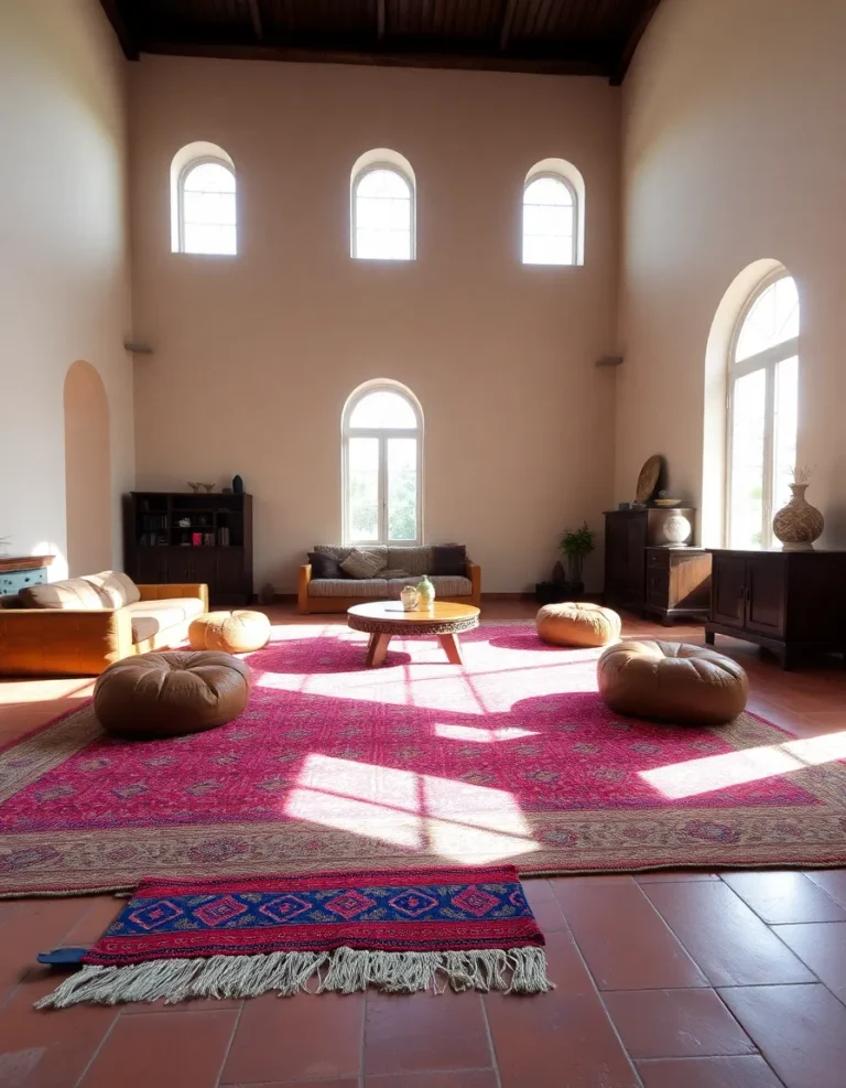
4. Let Patterns Play Nice
Patterns can be tricky. Throw too many bold ones into the mix, and suddenly your room looks like it’s having an identity crisis. But pair them right, and they’ll elevate your space like a pro. The trick? Keep your patterns in the same color family or use neutrals as a buffer.
For instance, if you have a bold floral pillow with hints of cobalt blue, pair it with a neutral striped or geometric throw in gray or white. The neutral pattern keeps things cohesive without competing for attention. And if you’re feeling extra, a small animal print in black and white can add edge without clashing.
Confession: I once bought a leopard-print rug thinking it was ~subtle~. Spoiler: it wasn’t. But layered under a neutral coffee table and paired with solid-colored furniture, it somehow worked. Moral of the story? Even the wildest patterns can behave if you give them the right company.
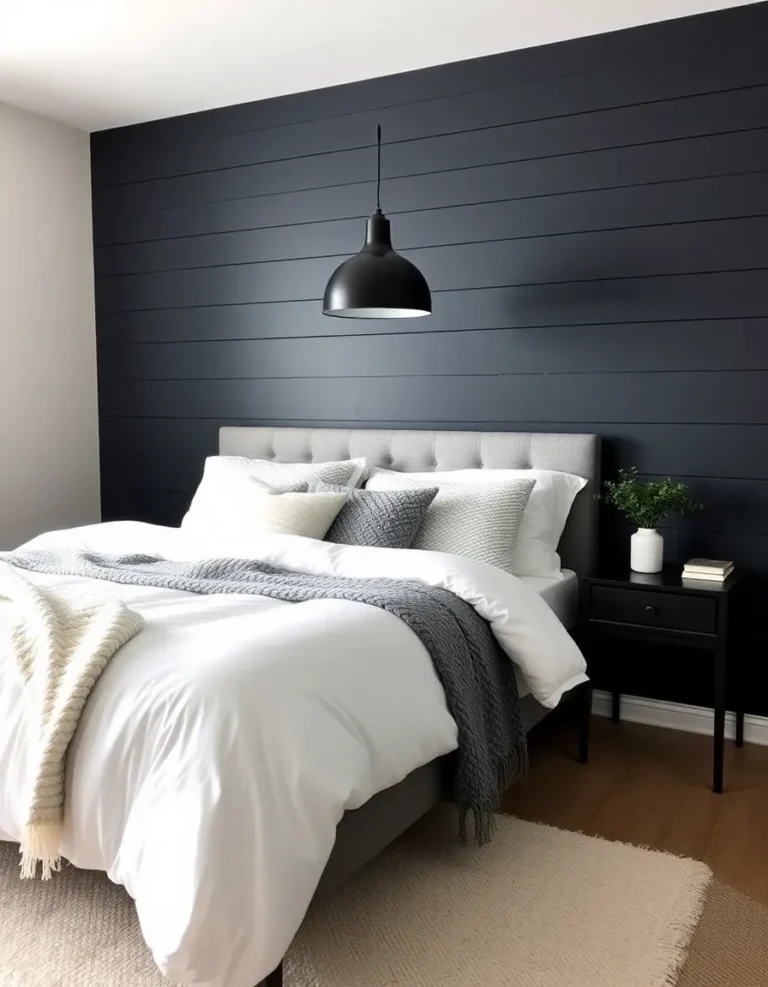
5. Don’t Forget About Metallics
Metallics are the unsung heroes of balancing bold and neutral. Gold, brass, or even brushed nickel can bridge the gap between loud and quiet, adding a touch of glam without going overboard. Picture this: a deep burgundy couch with gold legs, or a teal backsplash with matte black fixtures and brass hardware. Chef’s kiss.
They also reflect light, which helps keep bold colors from feeling too heavy. So if you’re worried about your navy accent wall making the room feel like a cave, add a mirror with a gold frame or some metallic side tables. Instant lift!
Fun fact: I used to think metallics were “too fancy” for my laid-back style. Then I tried a $20 brass lamp from a thrift store, and now I’m basically a magpie. Some risks are worth taking.
6. Experiment, Then Edit
Here’s the thing: rules are great, but they’re not set in stone. The best way to find your perfect balance? Play around, then edit ruthlessly. Start with more neutrals than you think you need, then add bold pieces one at a time. Step back. Squint. Does it feel right? If not, swap or remove something.
And don’t be afraid to break the “rules” if it feels good to you. Maybe you love the idea of a neutral sofa with five different bold pillows. Go for it! Your space should reflect your personality, not just a Pinterest board. (Though let’s be real, we all steal ideas from Pinterest.)
Final thought: Balancing bold and neutral isn’t about perfection—it’s about creating a space that makes you happy. So take a deep breath, grab that paint sample, and dive in. Worst case? You repaint. Best case? You fall in love with your home all over again.
So there you have it—your crash course in balancing bold colors with neutrals without losing your mind. Whether you’re a color addict or a neutral purist, finding that sweet spot will make your space feel fresh, intentional, and totally *you*. Now go forth and decorate like the fearless, fabulous human you are. And if all else fails? Just add more plants. Plants fix everything.