![]()
Popular Victorian Color Palettes: Jewel Tones, Neutrals & Florals
Ever walked into a room and felt like you’ve time-traveled straight into a Victorian novel? Maybe it’s the heavy drapes, the ornate furniture, or—more likely—those rich, dramatic colors that scream “I was born in the 19th century, and I have *opinions* about wallpaper.” If you’re obsessed with Victorian aesthetics (or just love a good deep dive into historical design), you’re in the right place. Today, we’re breaking down the most popular Victorian color palettes—jewel tones, neutrals, and florals—because nothing says “I appreciate the finer things” like a well-curated shade of emerald green.
Now, I know what you’re thinking: “But won’t my home look like a haunted mansion if I go full Victorian?” Not necessarily! With the right balance, these colors can feel luxurious, moody, and surprisingly modern. Whether you’re redecorating your entire house or just adding a few Victorian-inspired accents, understanding these palettes will help you nail the look without summoning the ghost of Queen Victoria herself. So, grab your tea (pinky up, of course), and let’s get into it.
1. Jewel Tones: The Drama Queens of Victorian Color
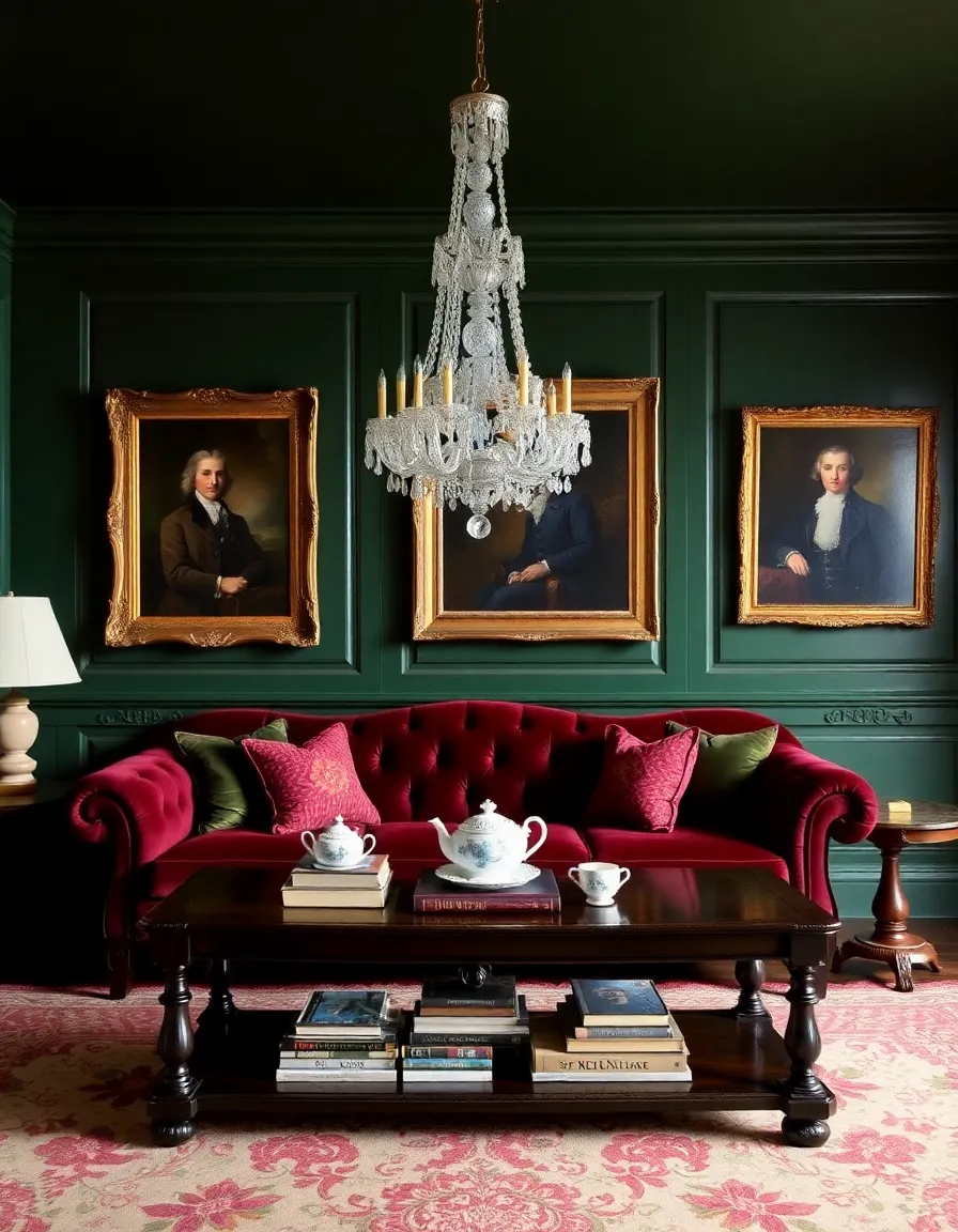
If Victorian colors had a personality, jewel tones would be the over-the-top theater kid who *always* gets the lead role. We’re talking deep emerald greens, sapphire blues, ruby reds, and amethyst purples—colors so rich they practically demand a velvet chaise lounge and a candelabra. These shades were everywhere in Victorian design, from walls to upholstery, and for good reason: they scream opulence.
Why did Victorians love jewel tones so much? Well, for starters, these colors were expensive. Synthetic dyes were just becoming a thing, so vibrant hues were a flex—like showing off your brand-new iPhone, but with more drapery. Plus, jewel tones pair beautifully with gold accents, dark woods, and intricate patterns, which were all the rage back then. Want to bring this drama into your own space? Try painting an accent wall in a deep teal or using jewel-toned throw pillows to add a touch of Victorian glam without going full Gothic revival.
Pro tip: If you’re nervous about committing to a dark shade, start small. A jewel-toned lampshade or a framed print in a rich burgundy can give you that Victorian vibe without overwhelming your space. And hey, if you hate it, at least you didn’t wallpaper your entire parlor, right?

2. Neutrals: The Understated Elegance of Victorian Design
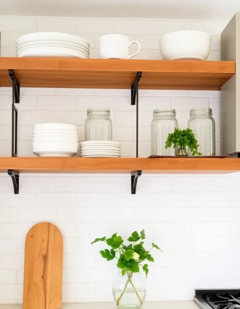
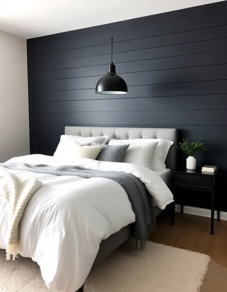
Okay, hear me out—I know “Victorian neutrals” sounds like an oxymoron. When we think of this era, we usually imagine maximalism on steroids. But believe it or not, Victorians also had a softer side. Creams, taupes, and warm grays were often used as backdrops for those bold jewel tones and intricate patterns. Think of them as the supporting actors that let the drama queens shine.
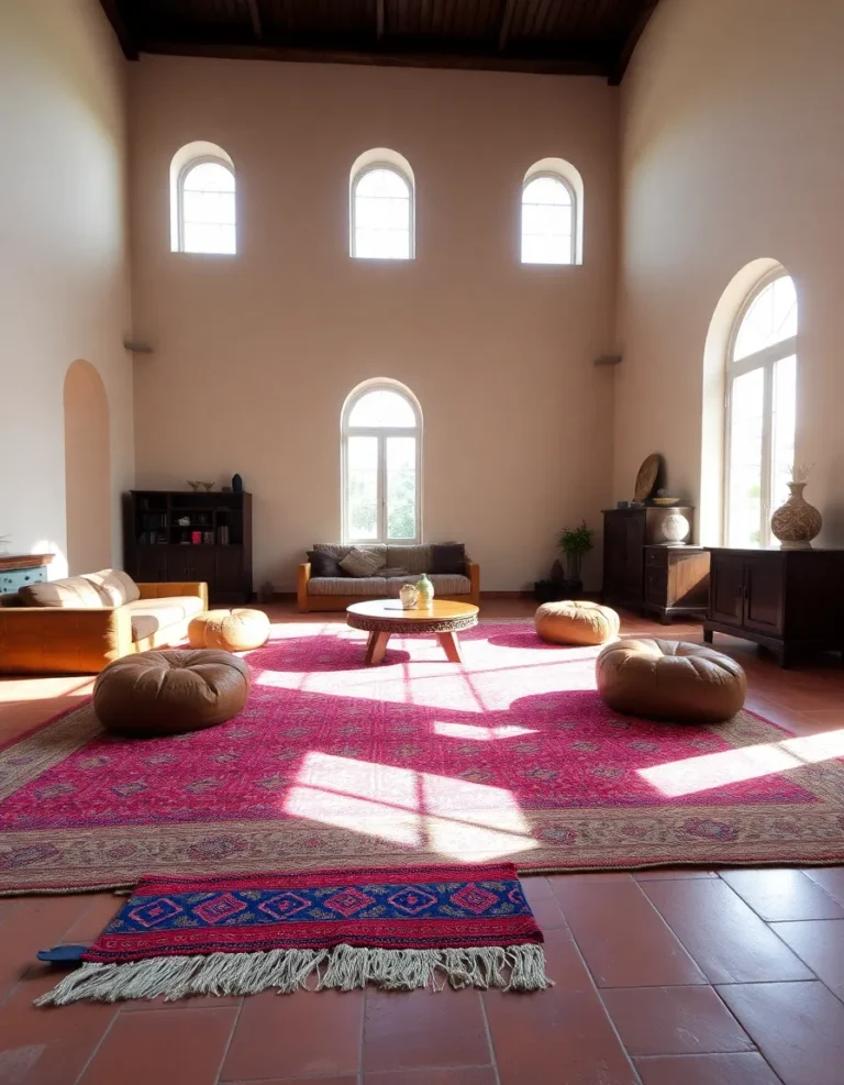
These neutral shades were especially popular in bedrooms and sitting rooms, where a calmer atmosphere was preferred. Picture this: a creamy off-white wall with dark wood trim, a floral rug in muted tones, and a tufted chaise lounge upholstered in beige damask. It’s elegant, it’s cozy, and it won’t give you a headache after five minutes. Plus, neutrals are *super* versatile—you can pair them with almost anything, which is probably why they’ve stuck around for centuries.
Want to try this look? Start with a neutral base (walls, large furniture) and layer in richer colors and textures through accessories. A mahogany bookshelf, a Persian rug, or even a vintage-inspired wallpaper in a subtle pattern can add that Victorian touch without making your room feel like a museum exhibit. And if you’re worried about it looking too bland? Just add a pop of jewel tone—maybe a sapphire blue throw or a garnet-red vase—to keep things interesting.

3. Florals: The Delicate (But Deadly) Side of Victorian Color
Ah, florals—the Victorian era’s answer to “how can we make every surface *busier*?” If you’ve ever seen a Victorian wallpaper sample, you know what I’m talking about: tiny roses, sprawling vines, and enough botanical detail to make your eyes cross. But here’s the thing: Victorians didn’t just slap florals everywhere for fun (okay, maybe a little). These patterns were symbolic, often representing nature, femininity, and even secret messages. Yeah, flowers had *drama* back then.
The key to pulling off Victorian florals without making your space look like a grandma’s couch? Balance. Pair a bold floral wallpaper with solid-colored furniture, or use floral upholstery on a single accent chair to keep it from overwhelming the room. And don’t be afraid to mix scales—a large-scale floral rug with a small-patterned wallpaper can create depth without clashing. Just remember: less is more, unless you’re going for the “I live in a botanical garden” aesthetic, in which case, go wild.
Personal anecdote time: I once tried to DIY a floral stencil on my bedroom wall. Let’s just say it looked more “kindergarten art project” than “sophisticated Victorian boudoir.” Moral of the story? If you’re not confident in your freehand skills, maybe leave the florals to the professionals. Or, you know, buy some pre-patterned wallpaper like a normal person.

So, there you have it—the three pillars of Victorian color palettes. Whether you’re all about the drama of jewel tones, the quiet elegance of neutrals, or the romantic chaos of florals, there’s a way to make these historic hues work in your modern home. The best part? You don’t have to commit to just one. Mix and match, experiment, and most importantly, have fun with it. After all, if the Victorians taught us anything, it’s that design should be bold, personal, and maybe a little extra.
Now, go forth and decorate like you’ve got a country estate to maintain. And if anyone questions your life choices, just tell them it’s *historically accurate*. Cheers!